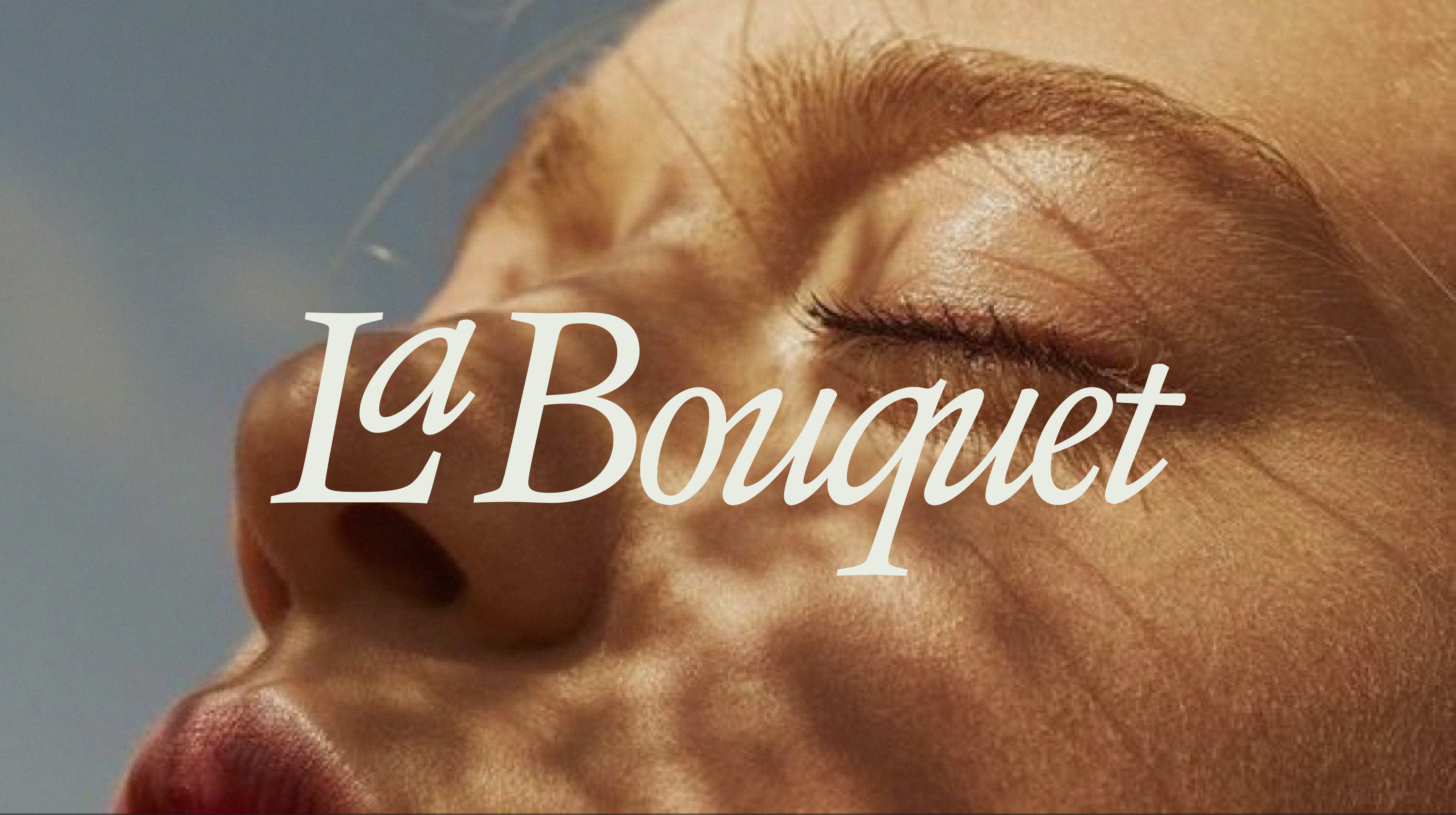
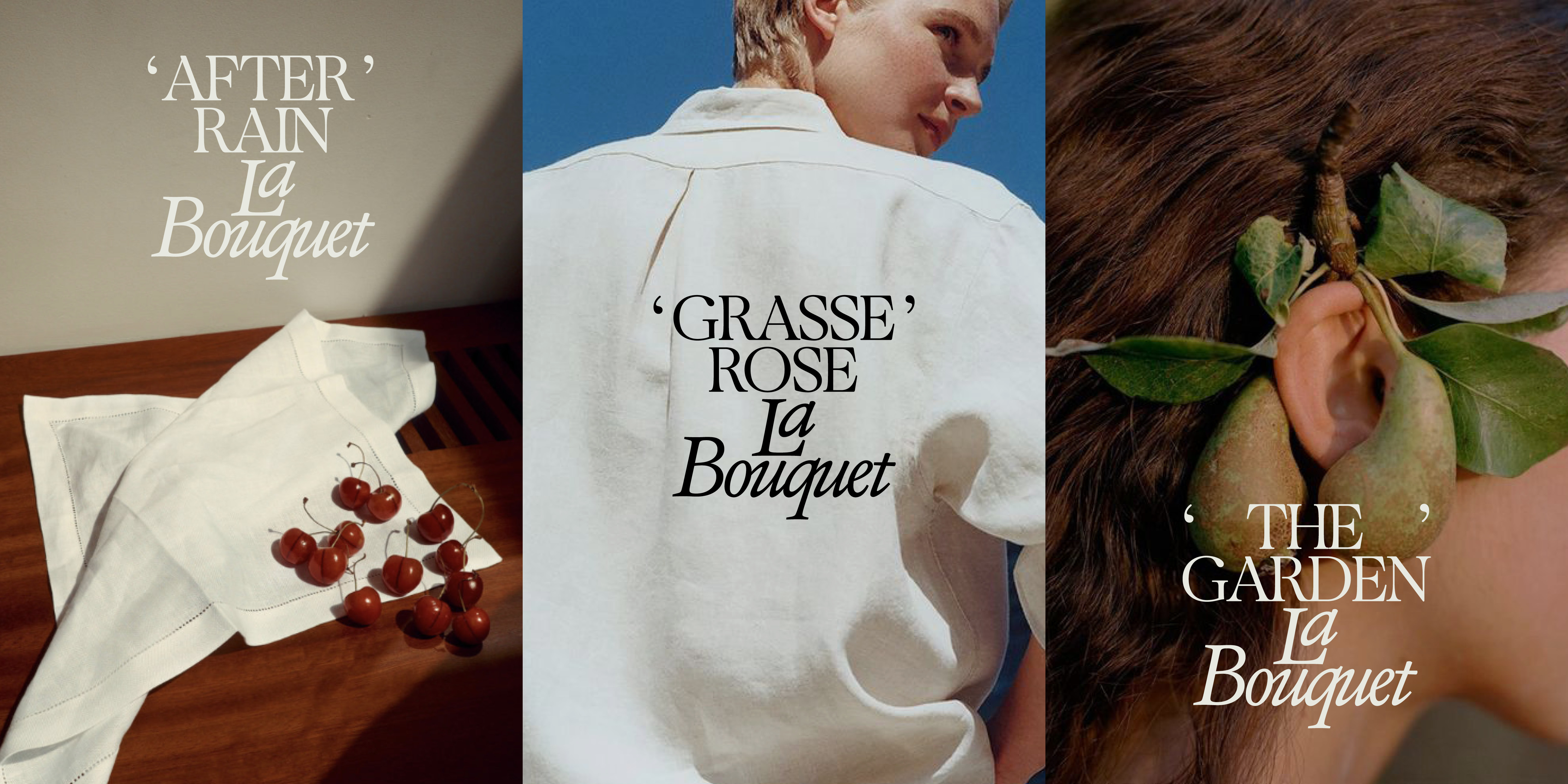
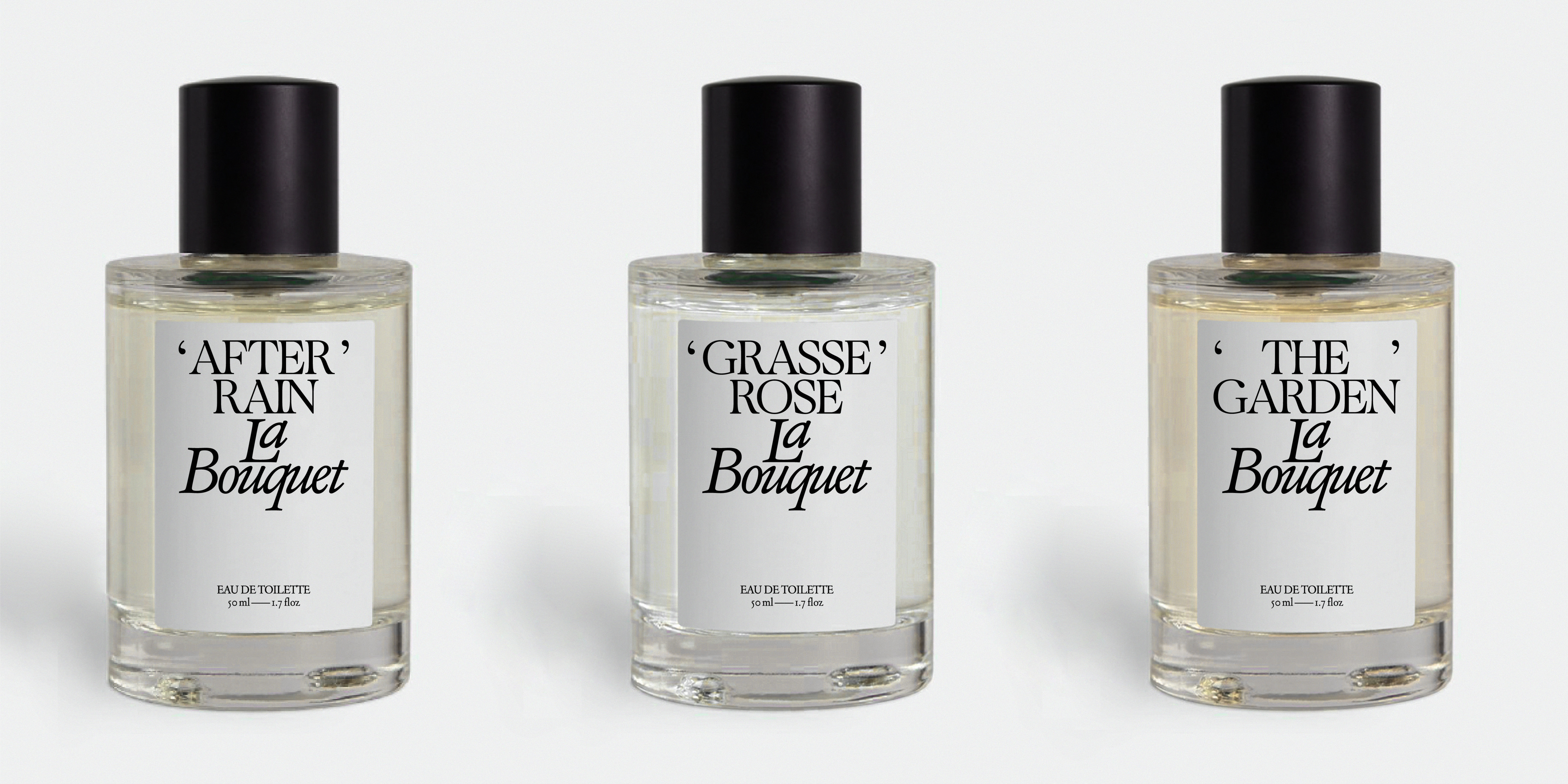
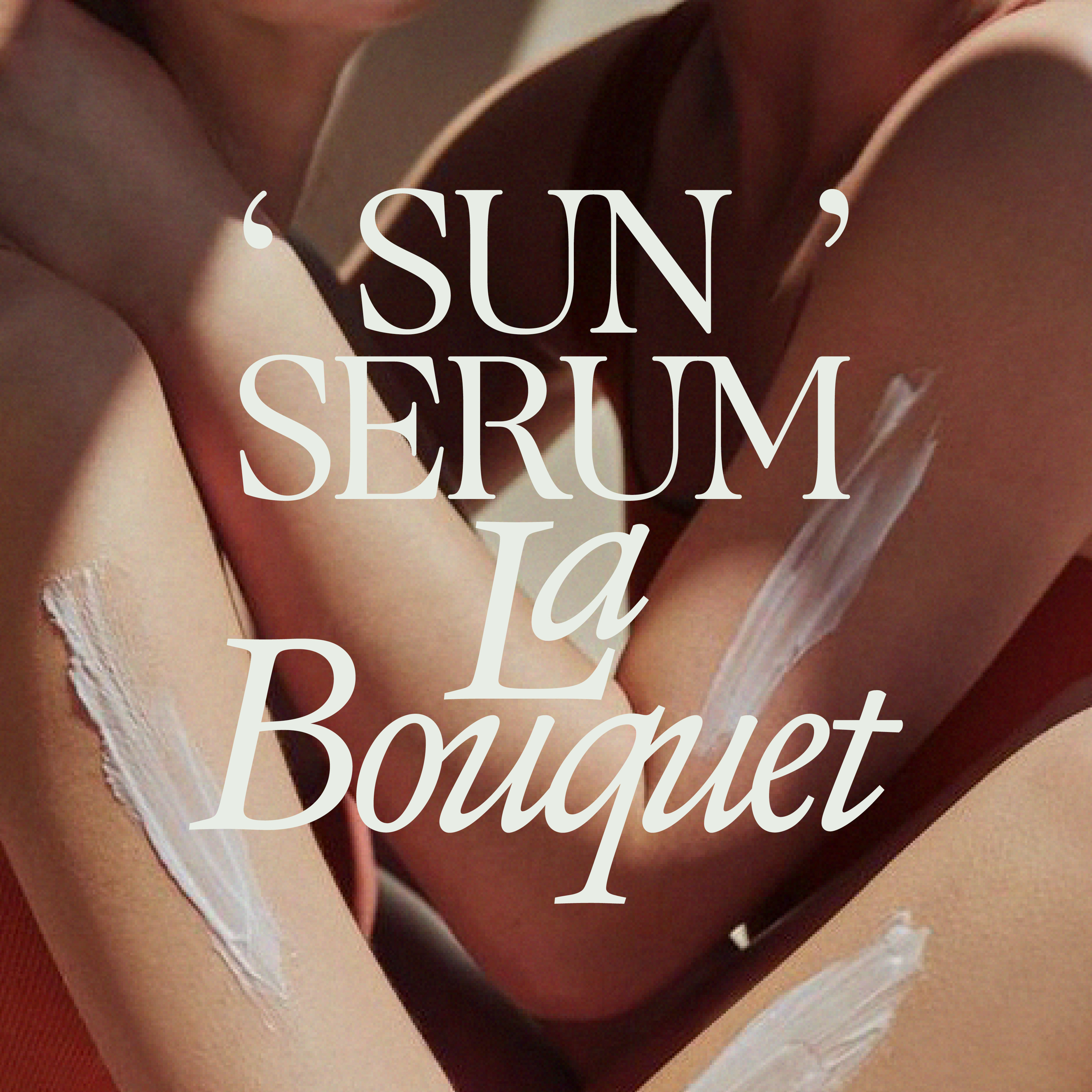
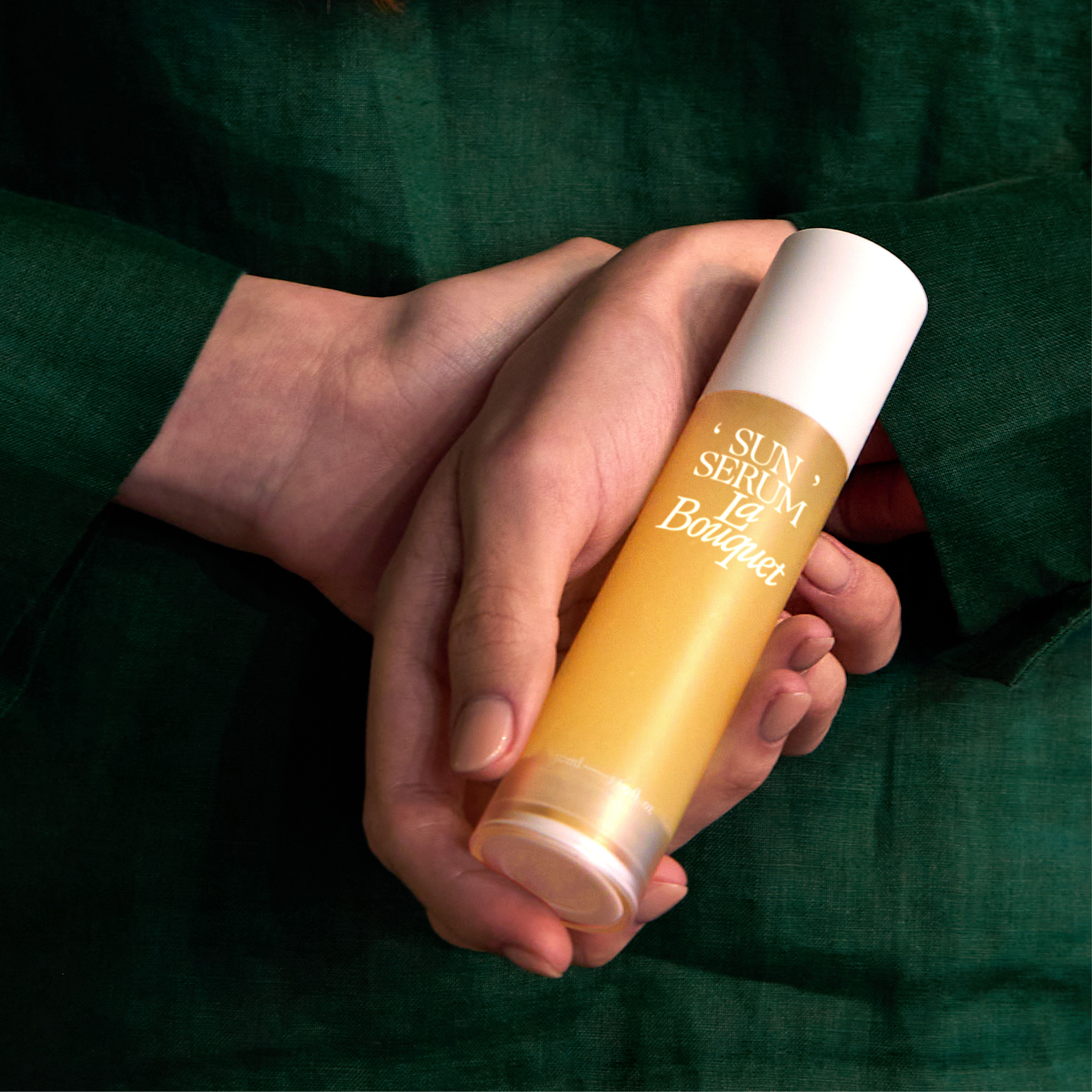
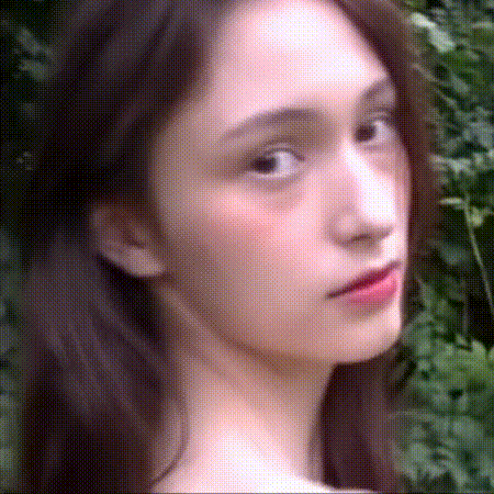
La Bouquet
Brand Strategy, Naming, Brand Identity, Art Direction, Packaging, Social, Website, Brand Guideline
Client — SiYeon
Motion — Sohyun Park
Role — Creative Director, Art Director, Designer
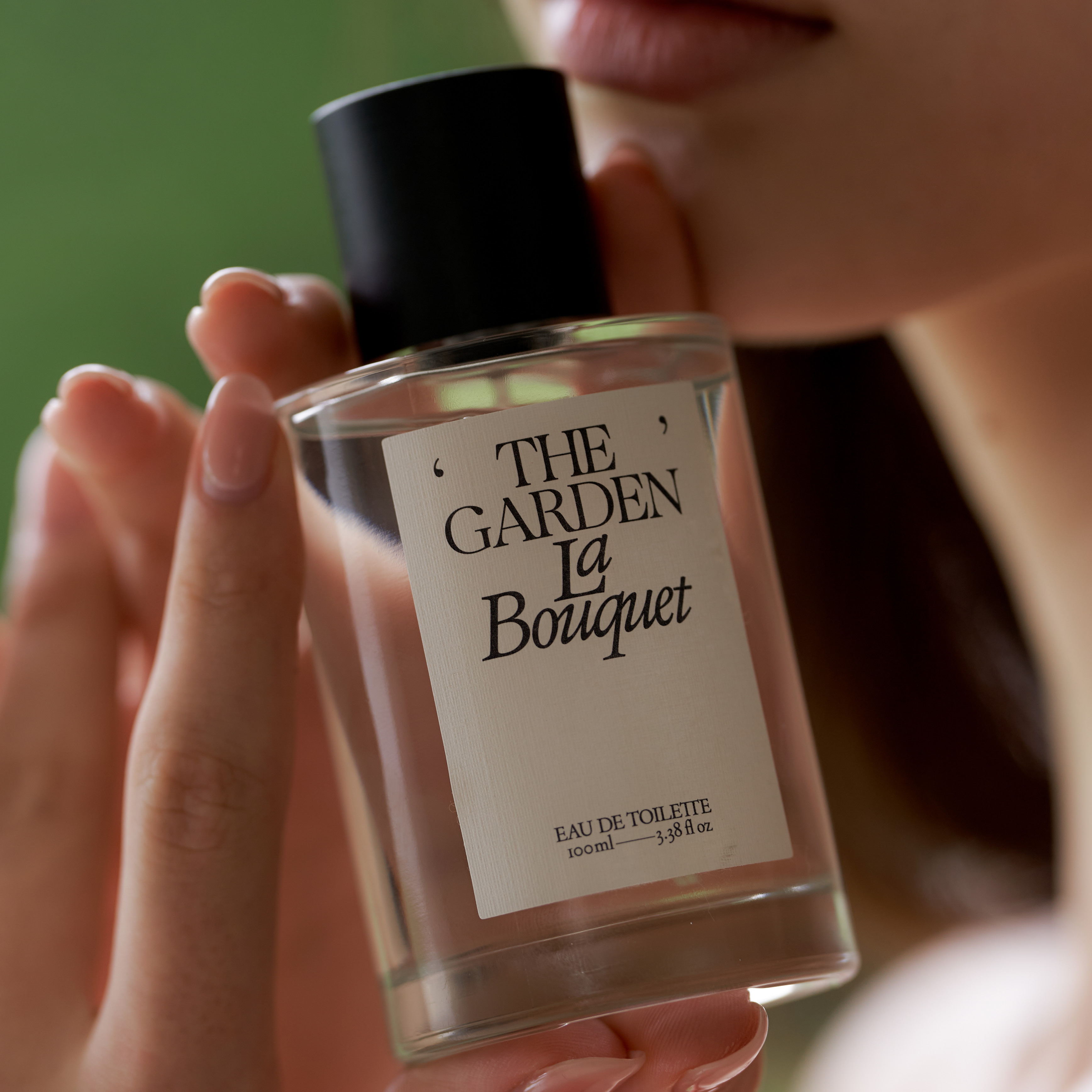
La Bouquet is a feminine fragrance and cosmetics brand that evokes unforgettable memories through the scents it offers. The main fragrance recommended by La Bouquet is one that conjures the feeling of experiencing the fresh scent of a bouquet of flowers through the layering of floral notes.
The name "La Bouquet" is derived from the word "bouquet," which means a bundle of flowers, and the feminine article "La" has been added to create a unique and elegant name. The typography used in the branding and packaging design resembles quick handwritten strokes, evoking emotions and memories, while the black and white color scheme, along with the appropriate white space, adds a poetic touch.
The photo art direction for La Bouquet emphasizes an emotional and cinematic feel, making it seem as though you're pausing a moment in your memories like a scene from a movie, rather than directly capturing the ingredients of the fragrance.
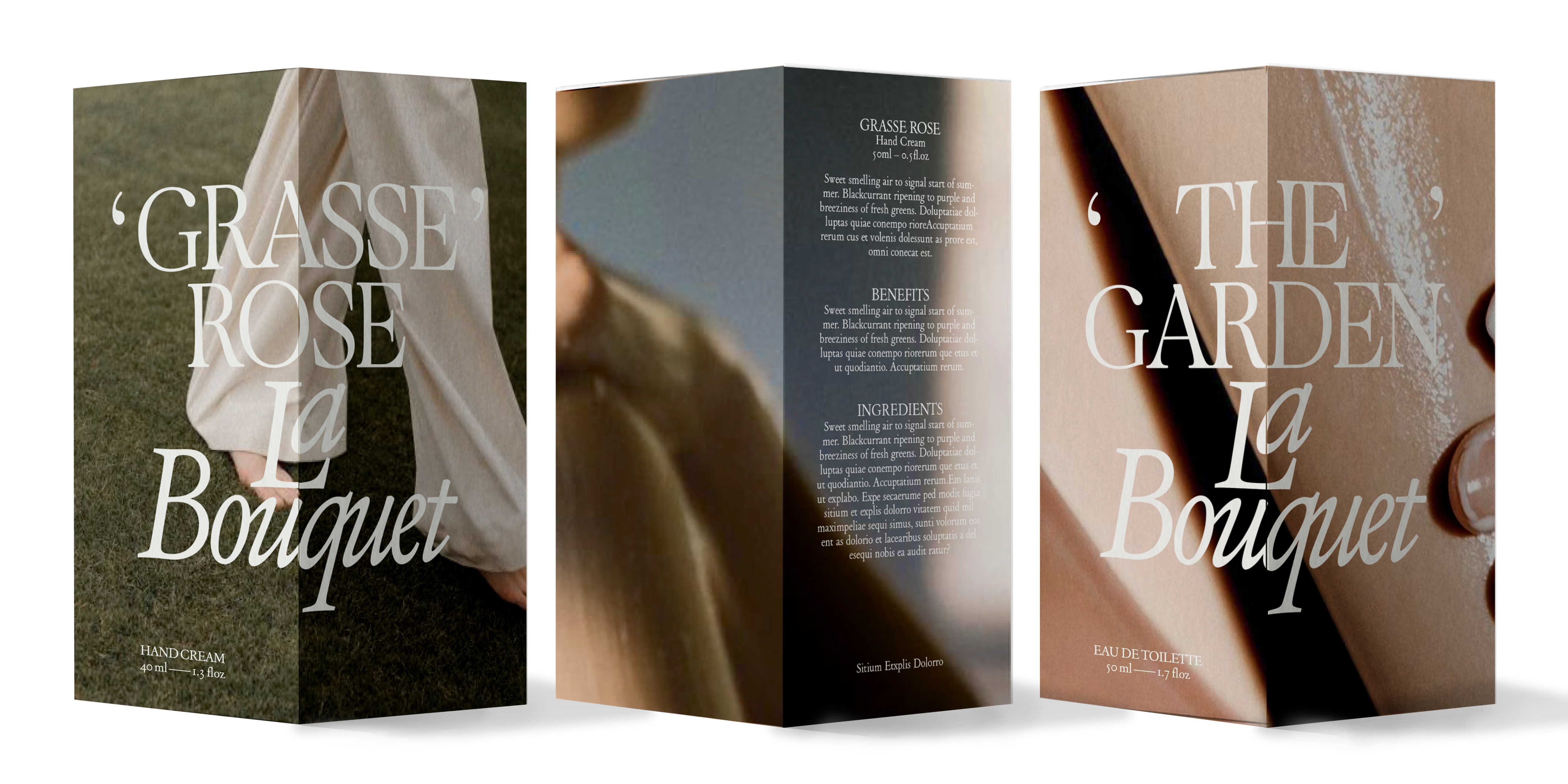
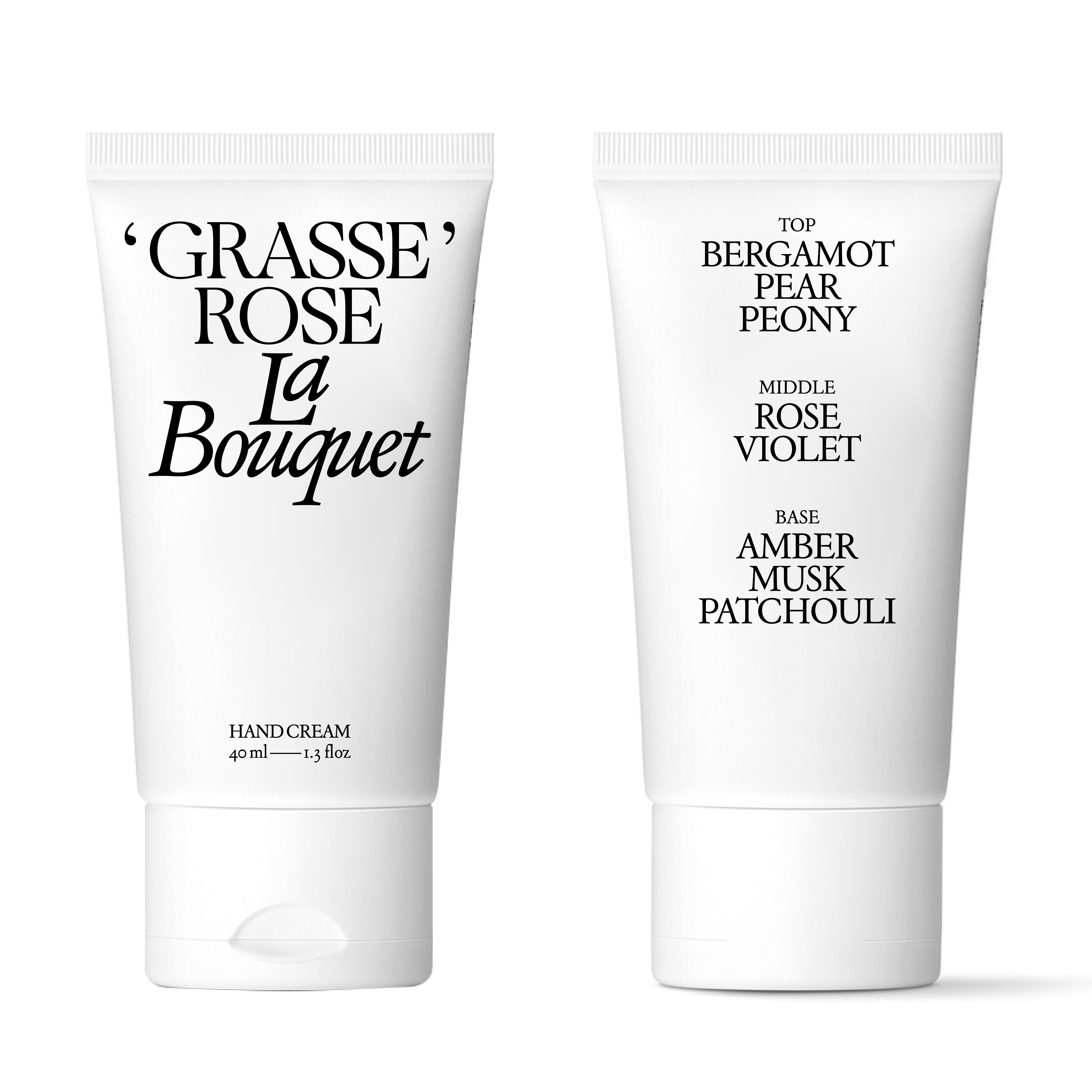
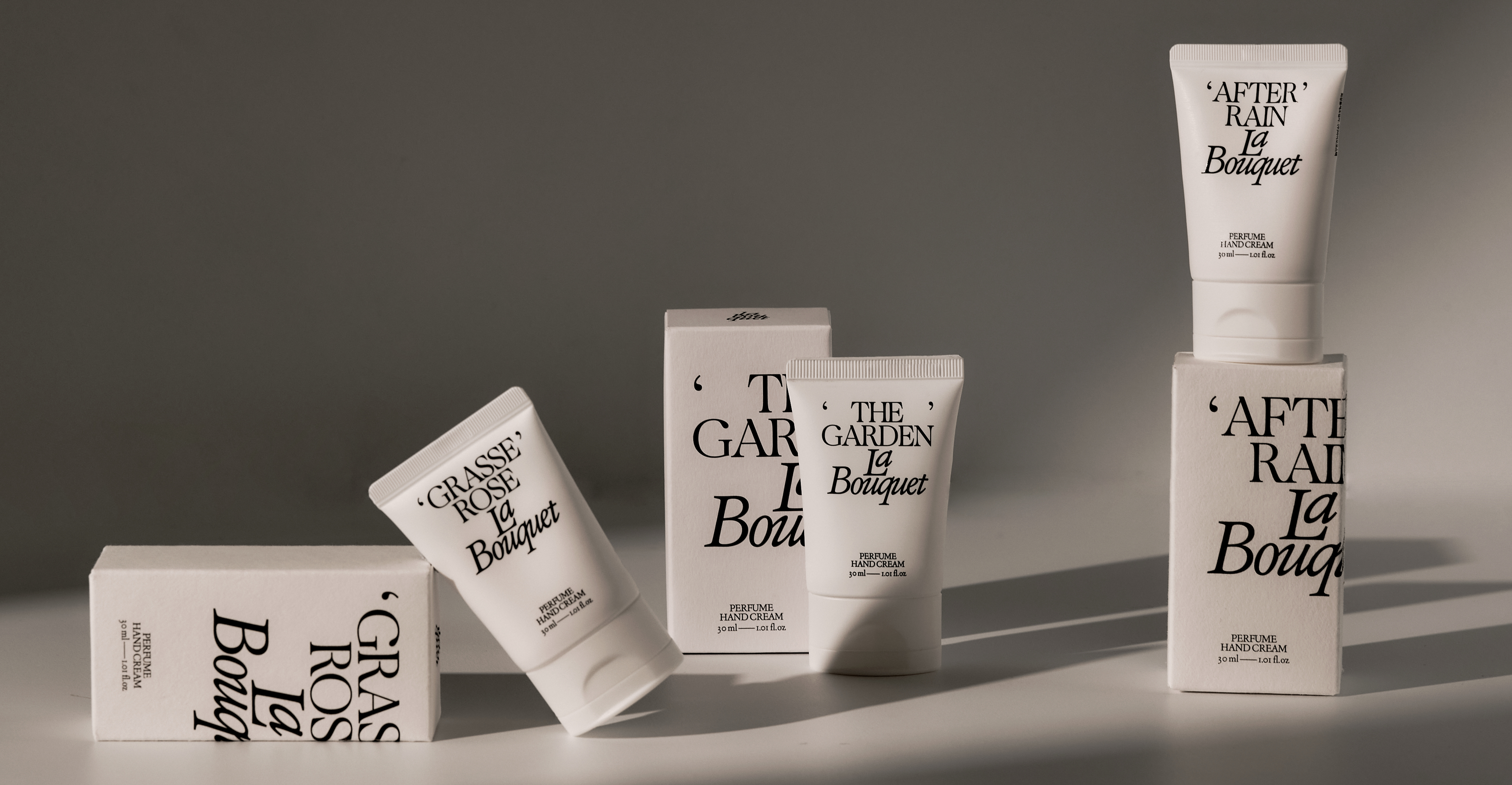
The extended categories include skin care and cosmetics.


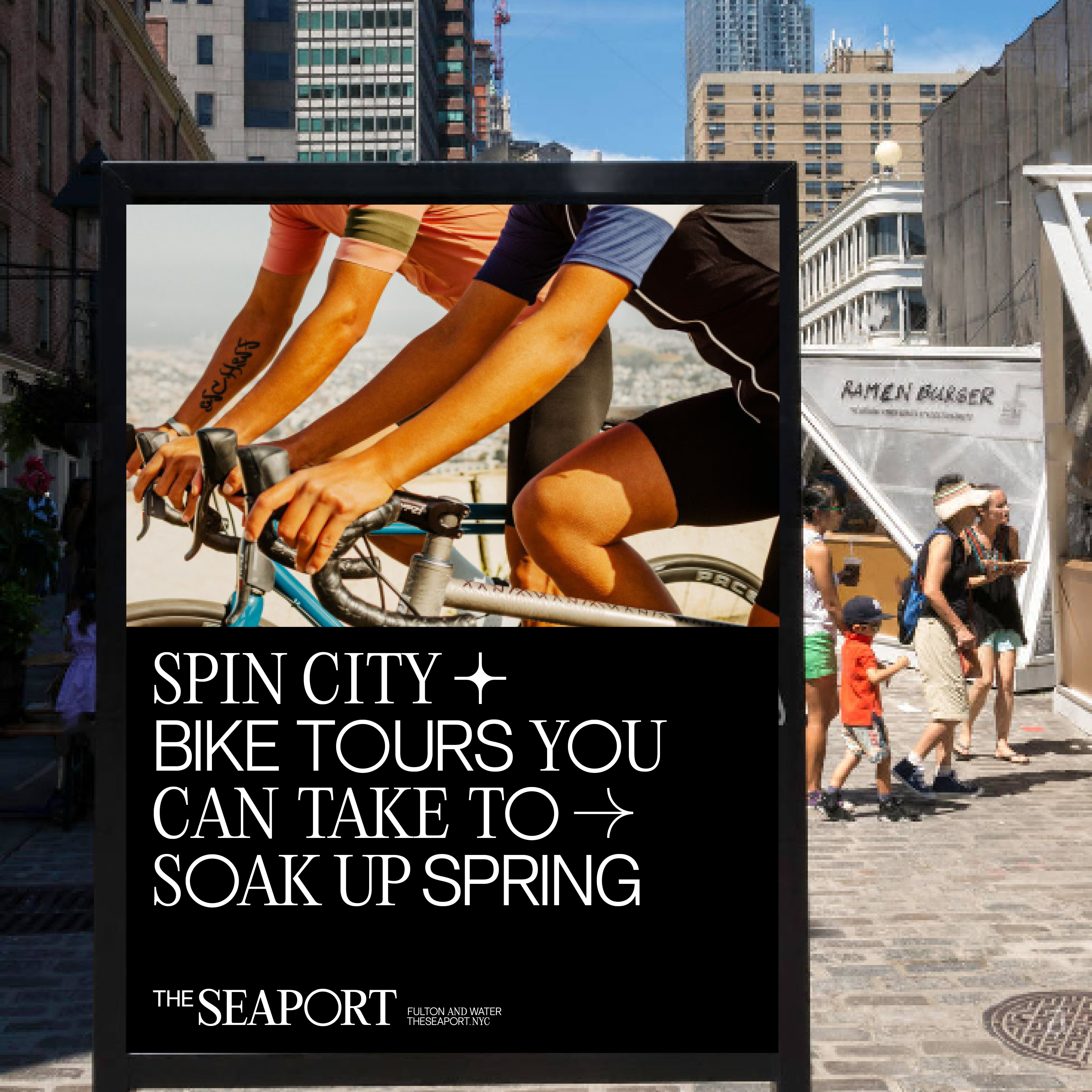
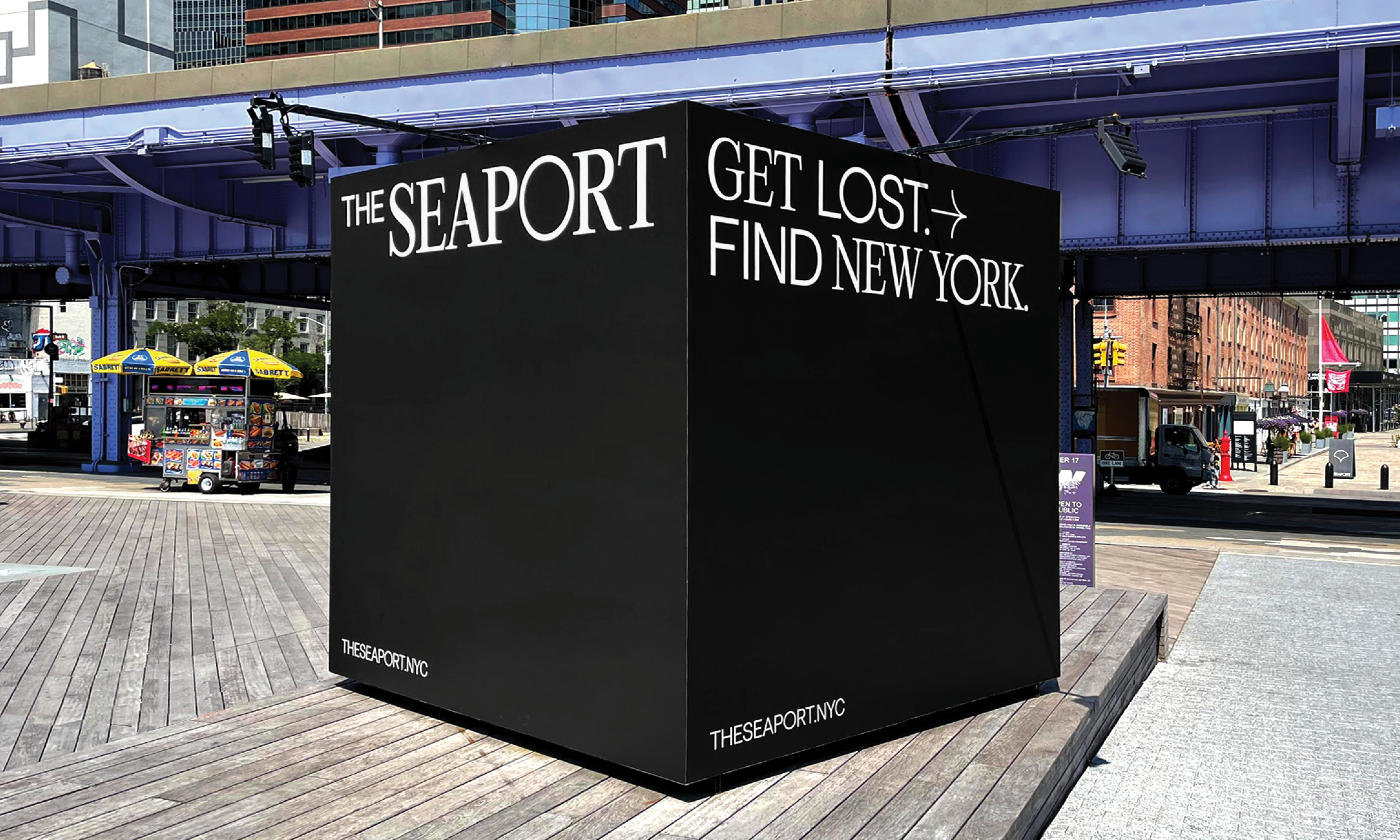
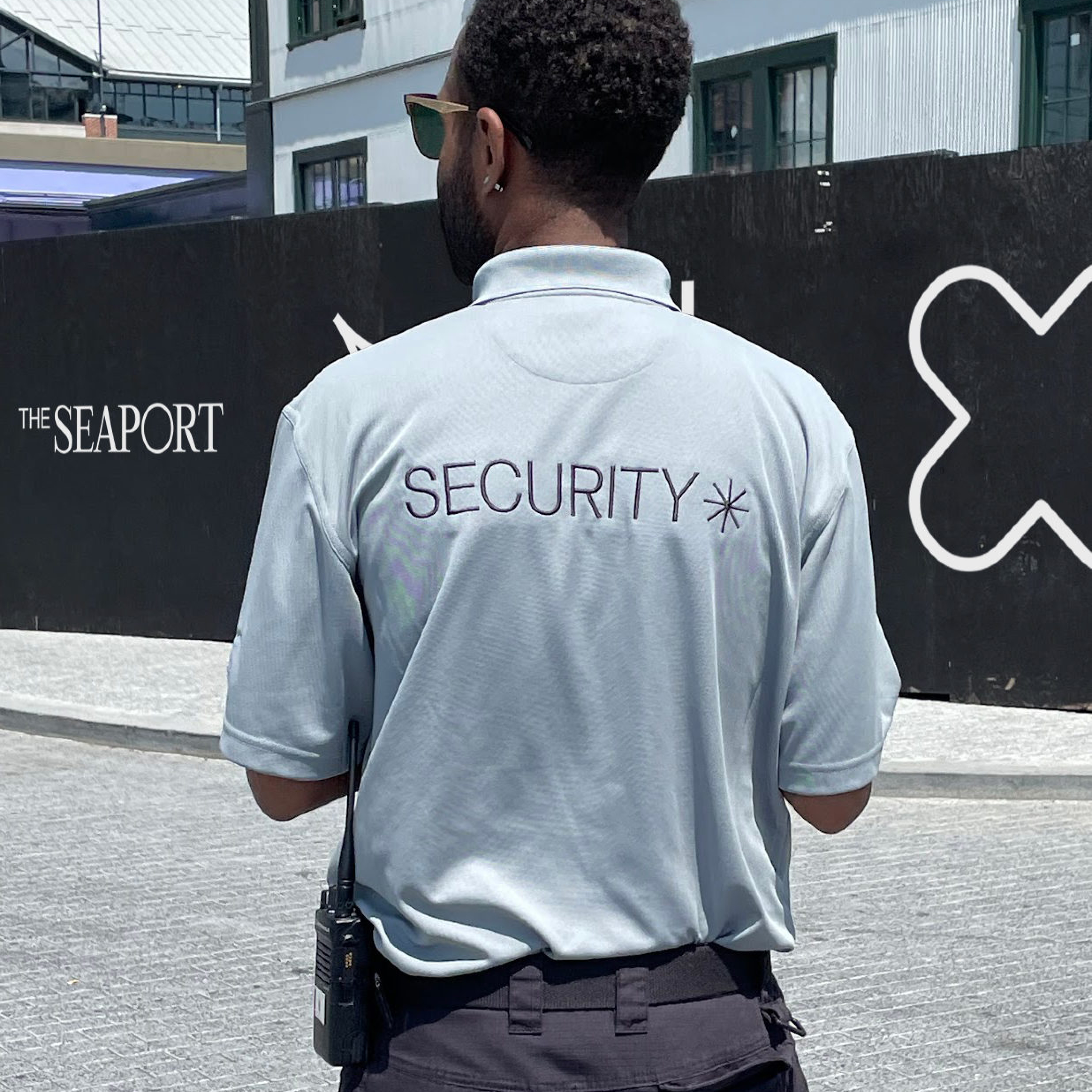
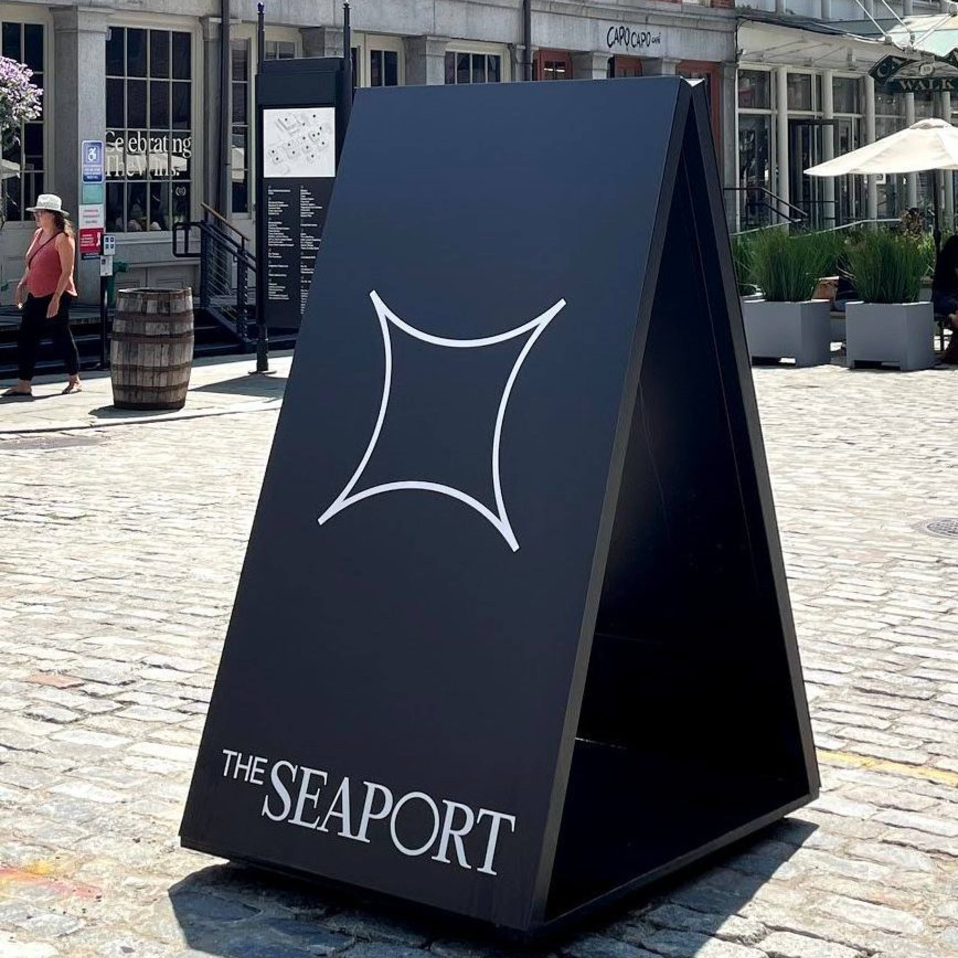
The Seaport
Brand Identity, Art Direction, Naming, Campaign, Website, Social, Brand Guideline, Motion Direction, Printed Collateral
Client — Howard Hughes
Team — 2x4
Photographer — Don Stahl
Role — Senior Design Lead
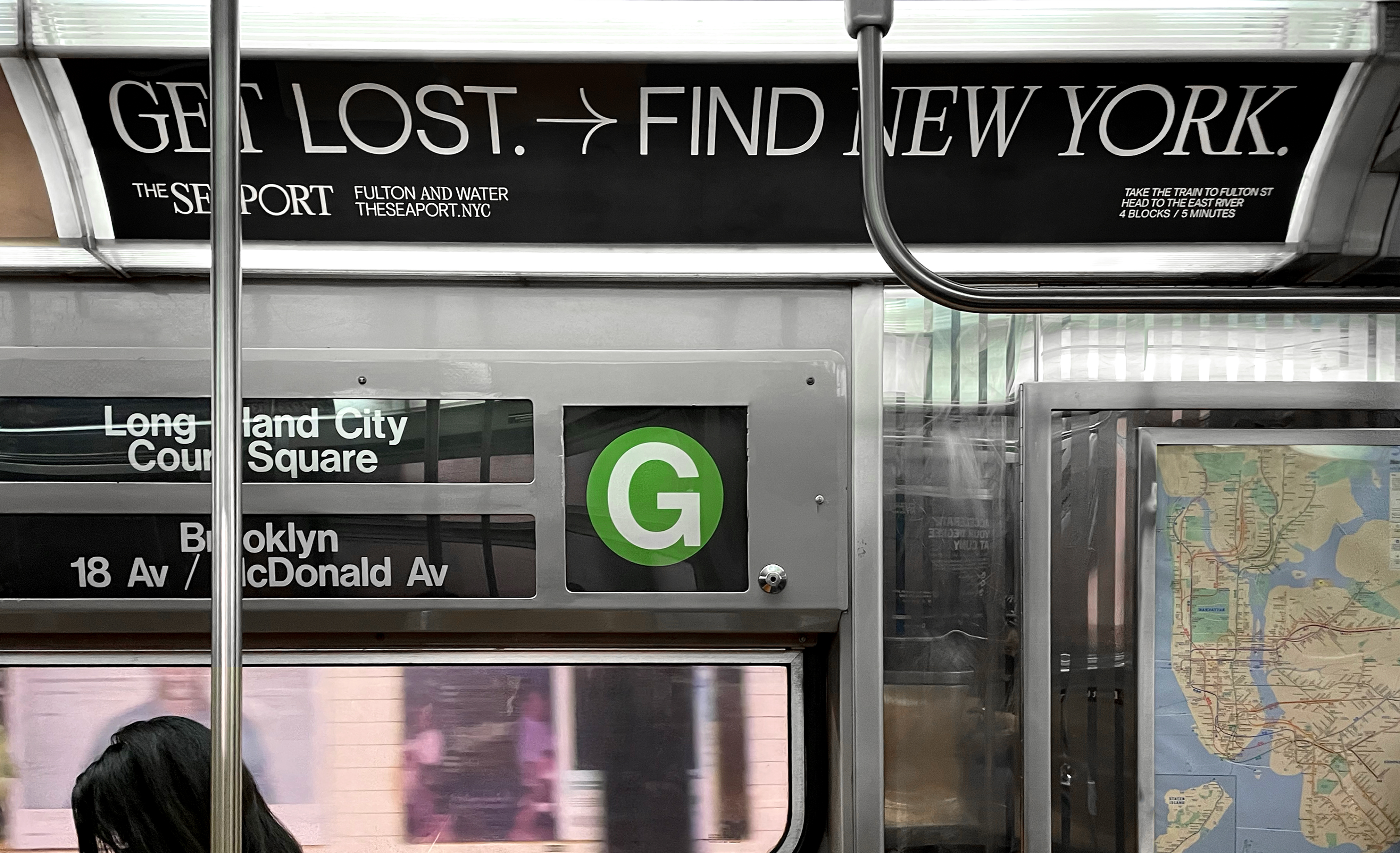
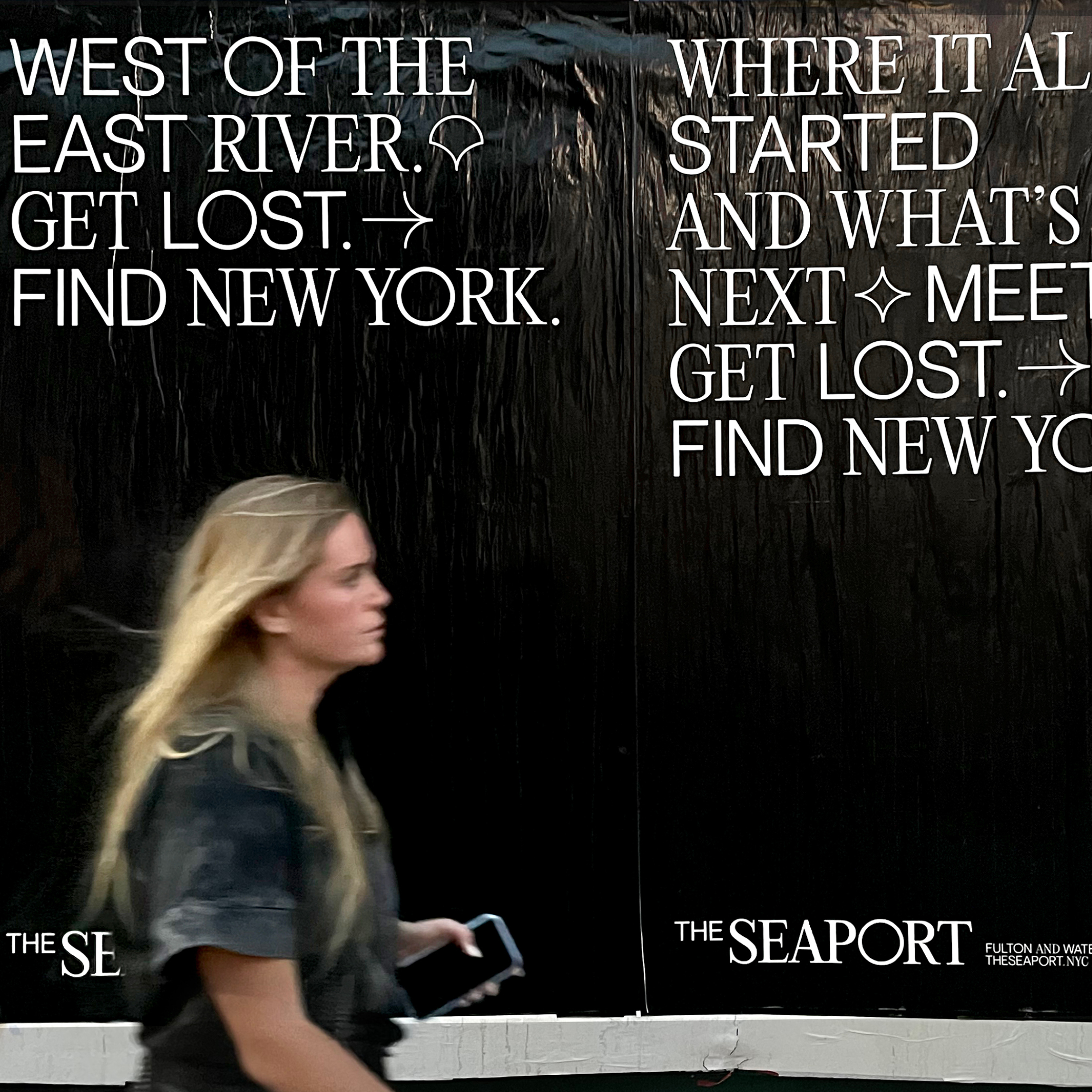
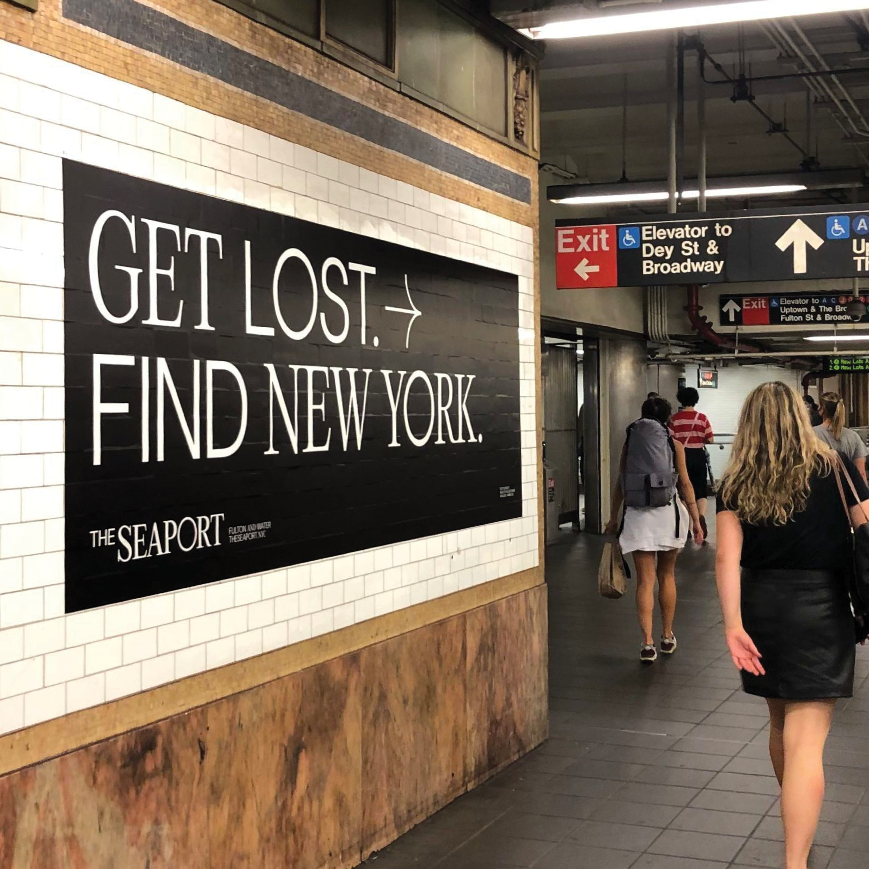
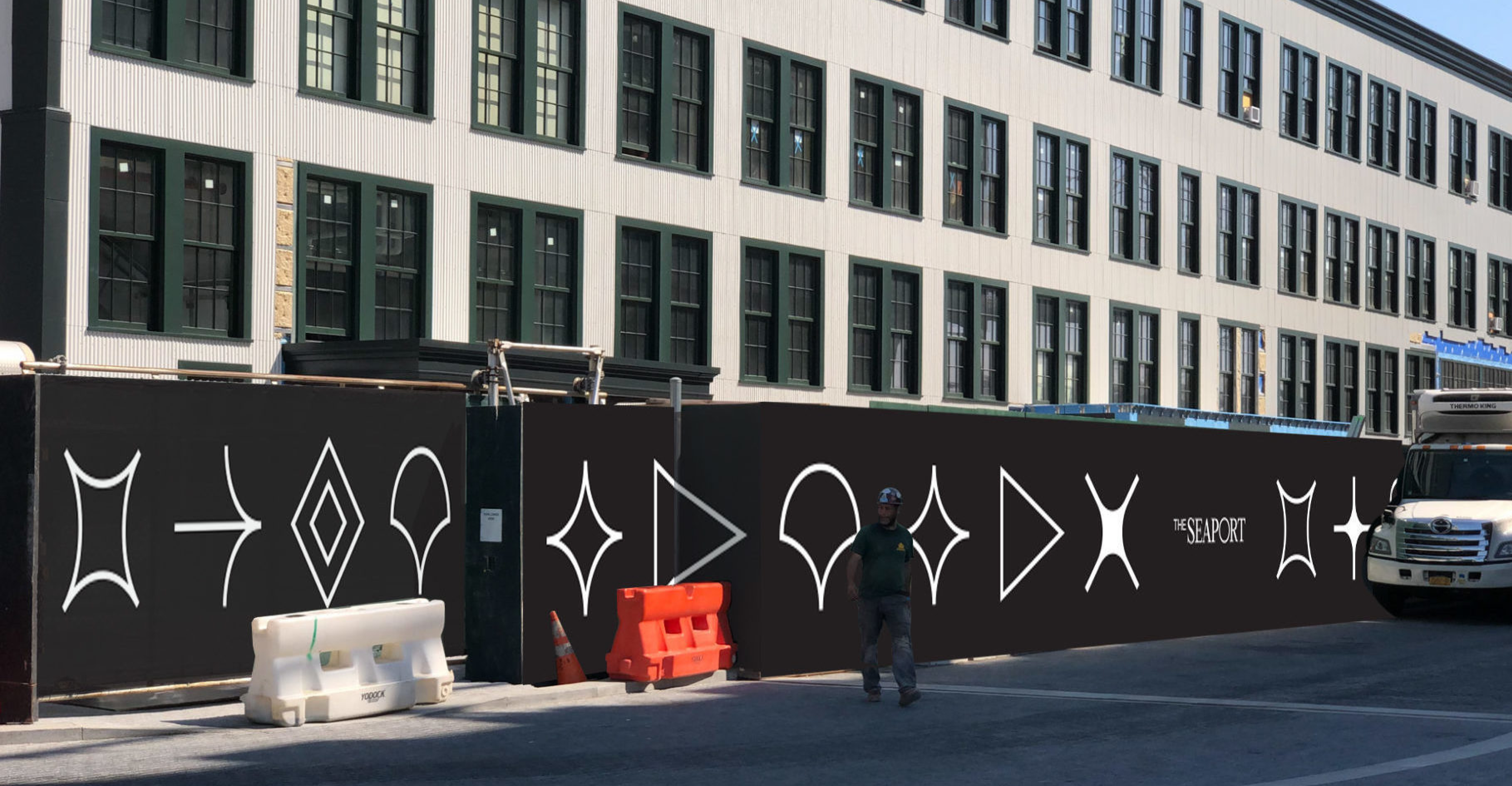
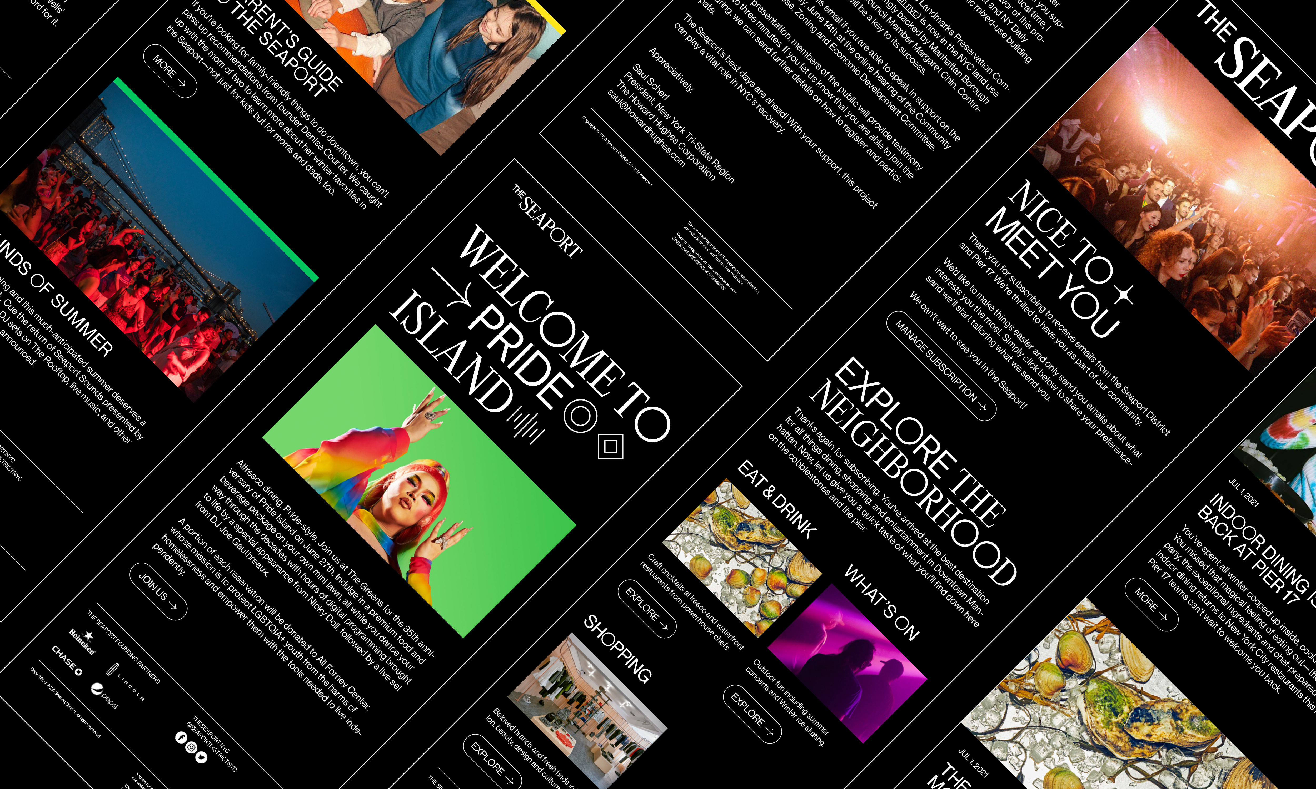
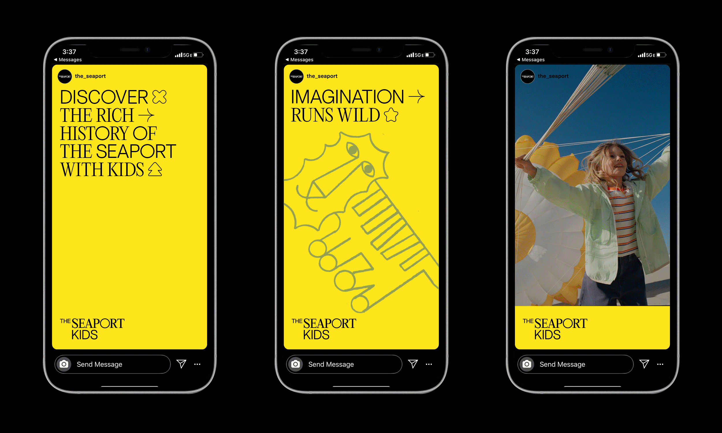
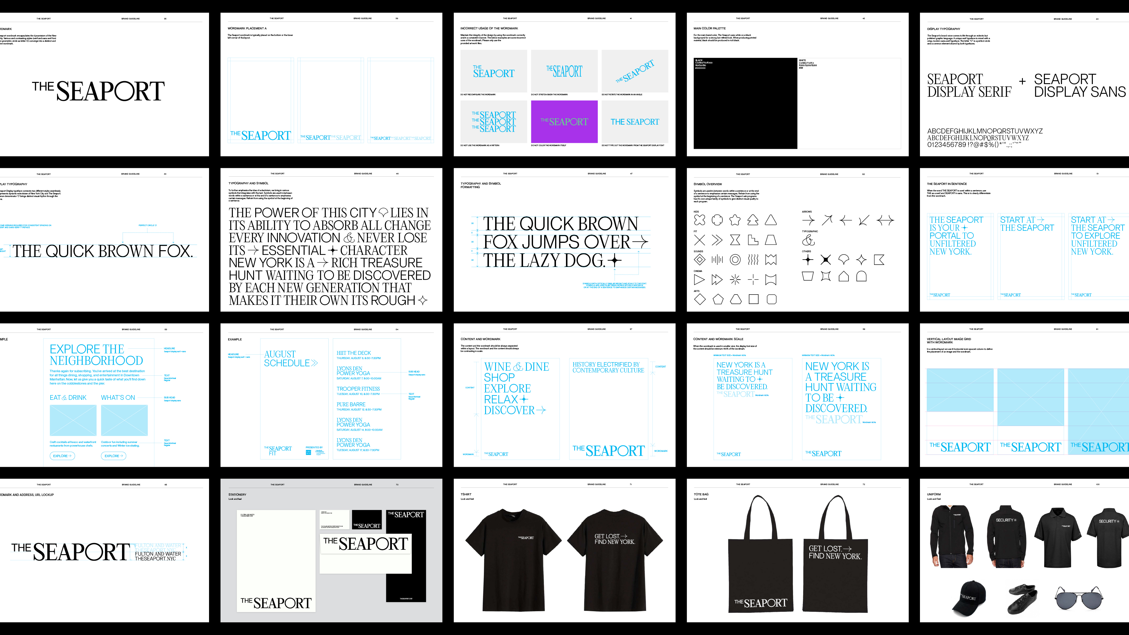
As one of the earliest ports in New York and a cornerstone of the city’s history, the Seaport neighborhood has evolved from a hub of trade to a cultural and commercial destination. Looking to reinvigorate the neighborhood, Howard Hughes Corporation partnered with us to reframe the Seaport in the minds of New Yorkers and visitors. We developed a new brand strategy, naming, visual expression, and brand voice as well as a citywide and social media campaign. Our campaign captures an irreverent New York tone and sensibility, through the tagline to “Get Lost. Find New York.” The custom typeface we designed is accented by playful iconography that embodies the eclectic and vibrant character of New York City streets and and the historic nature of the Seaport.


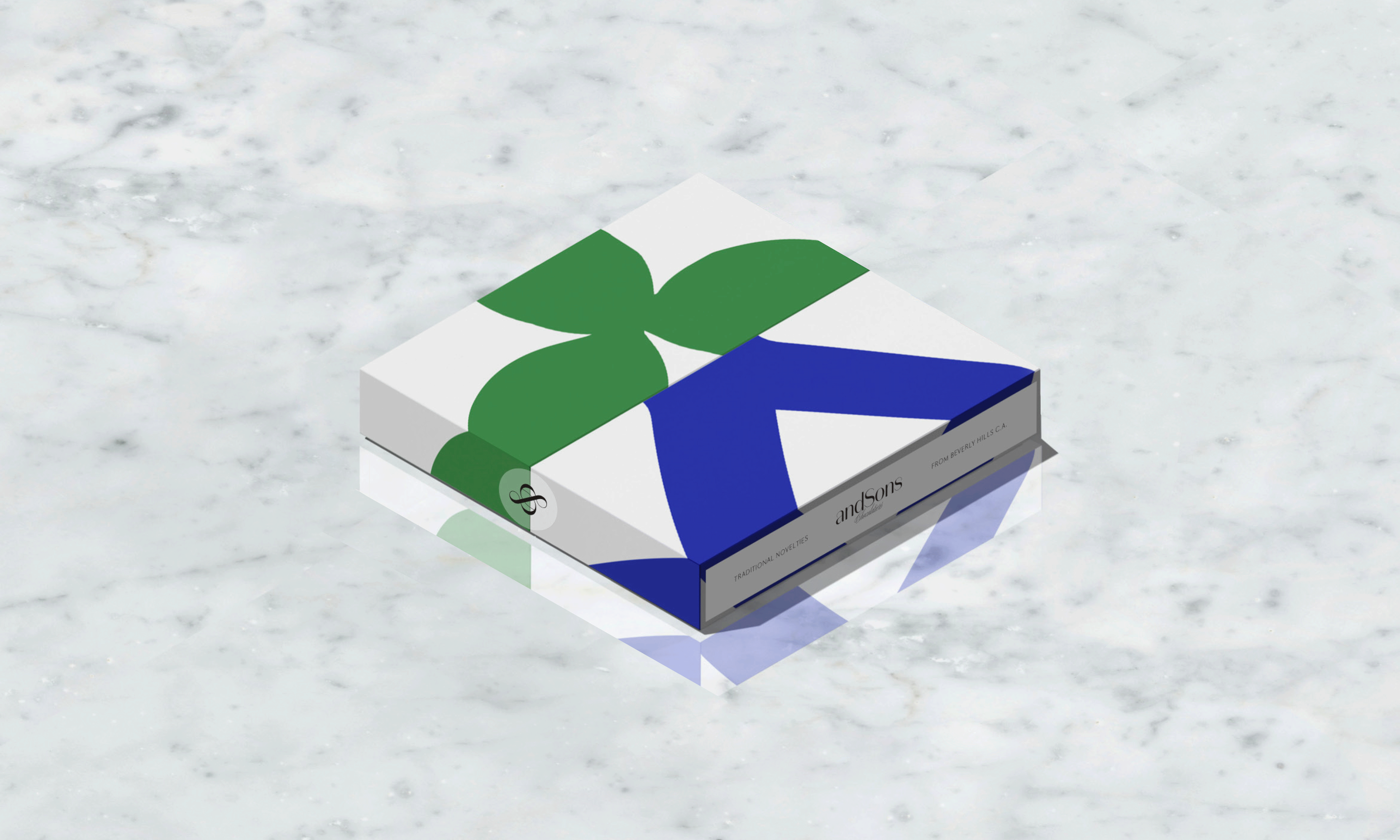
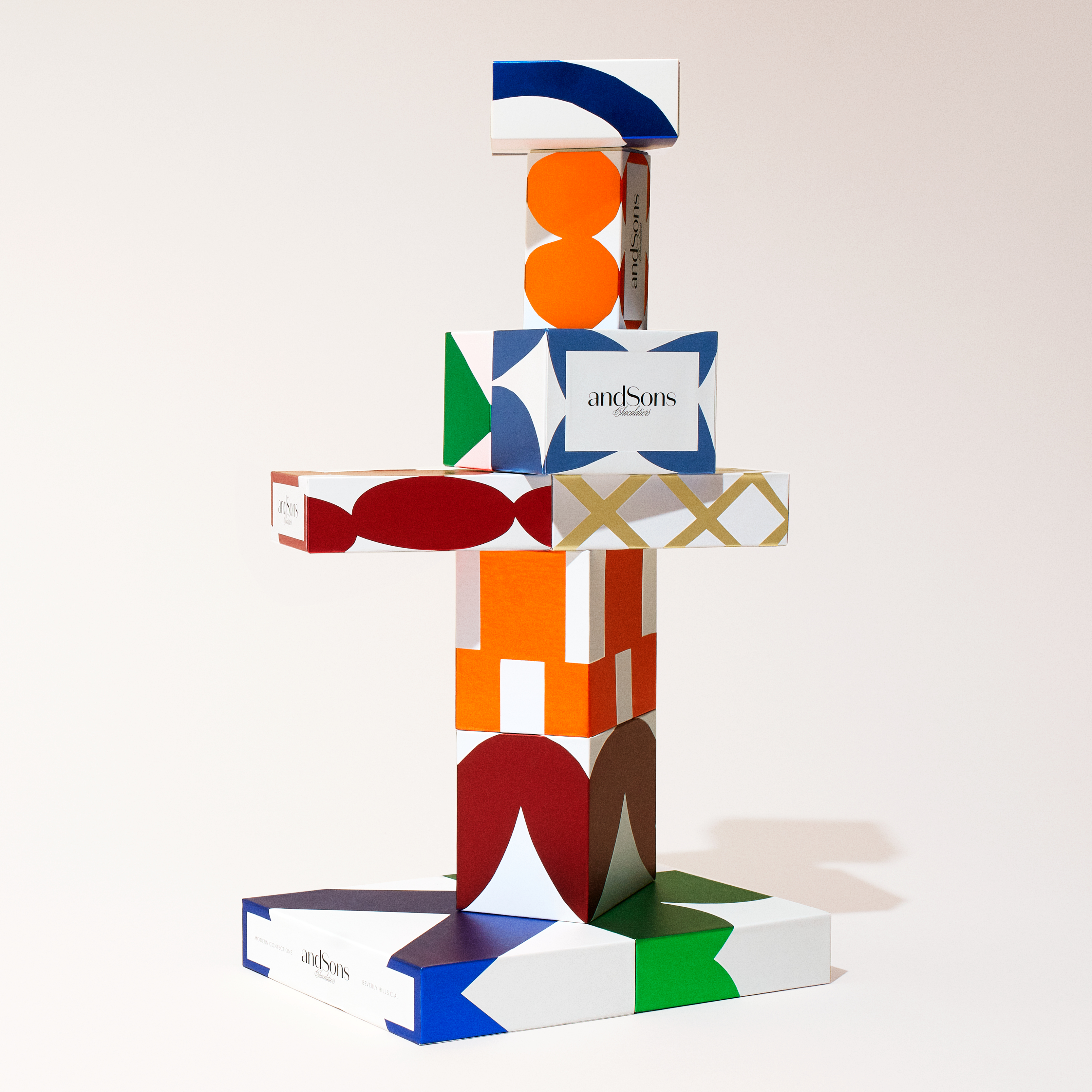
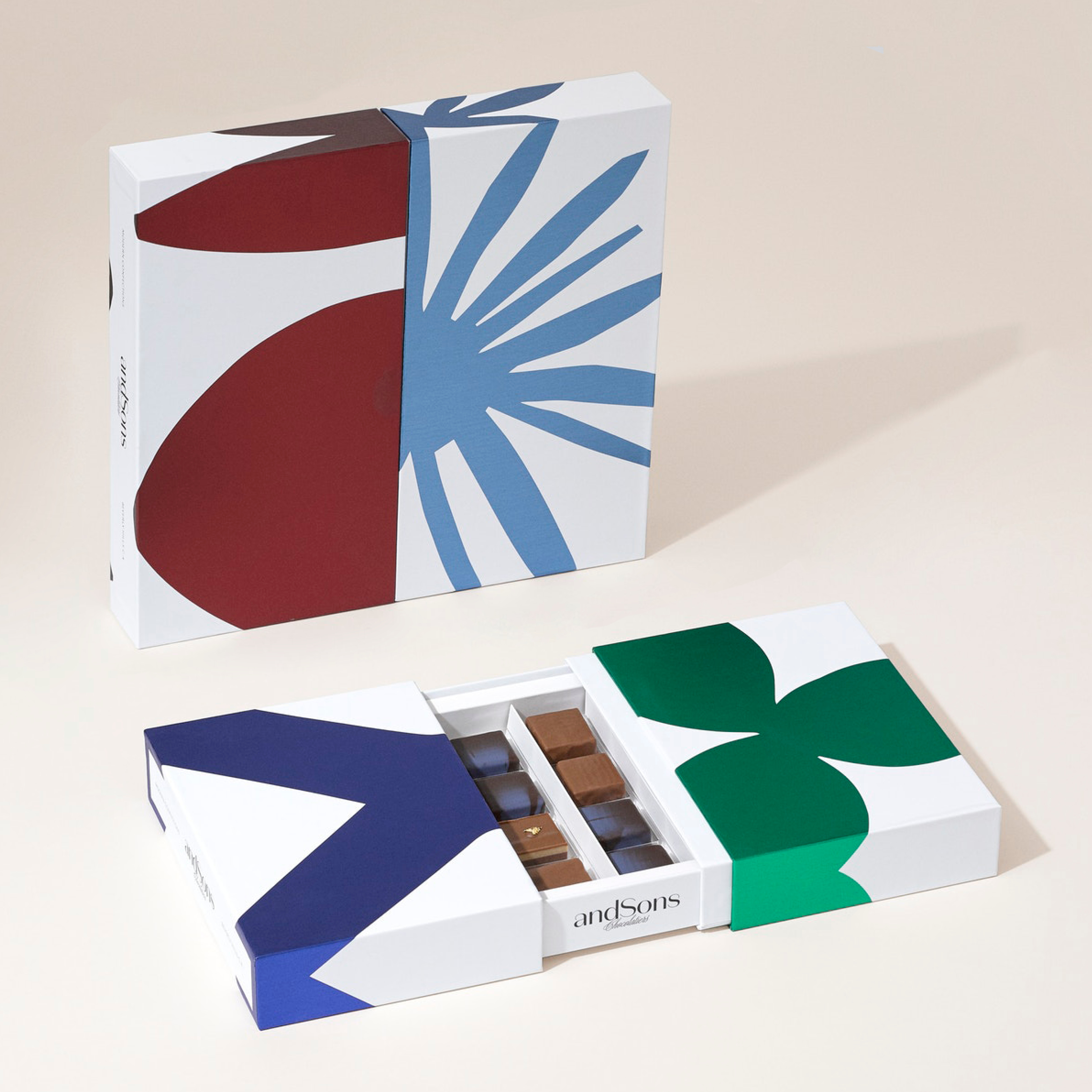
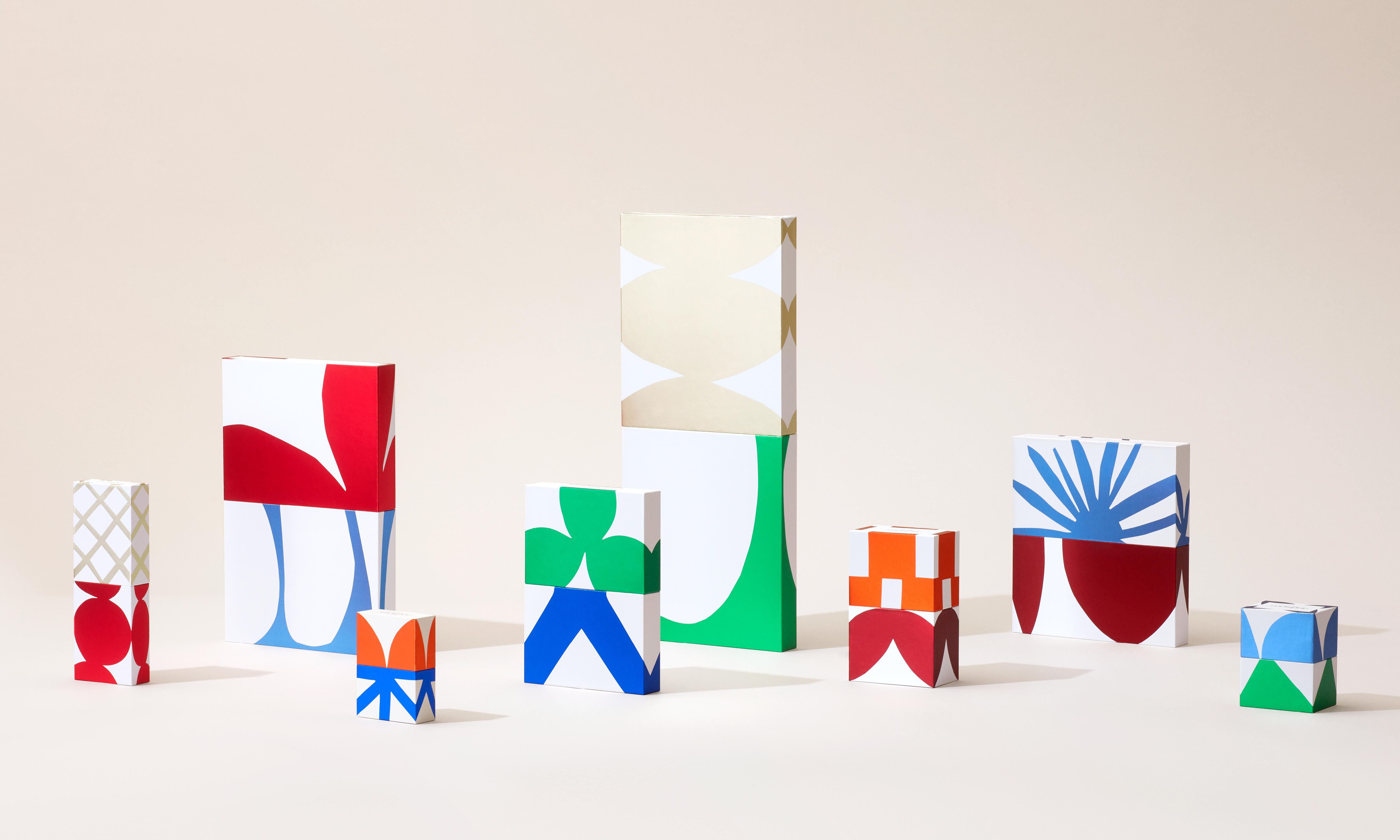
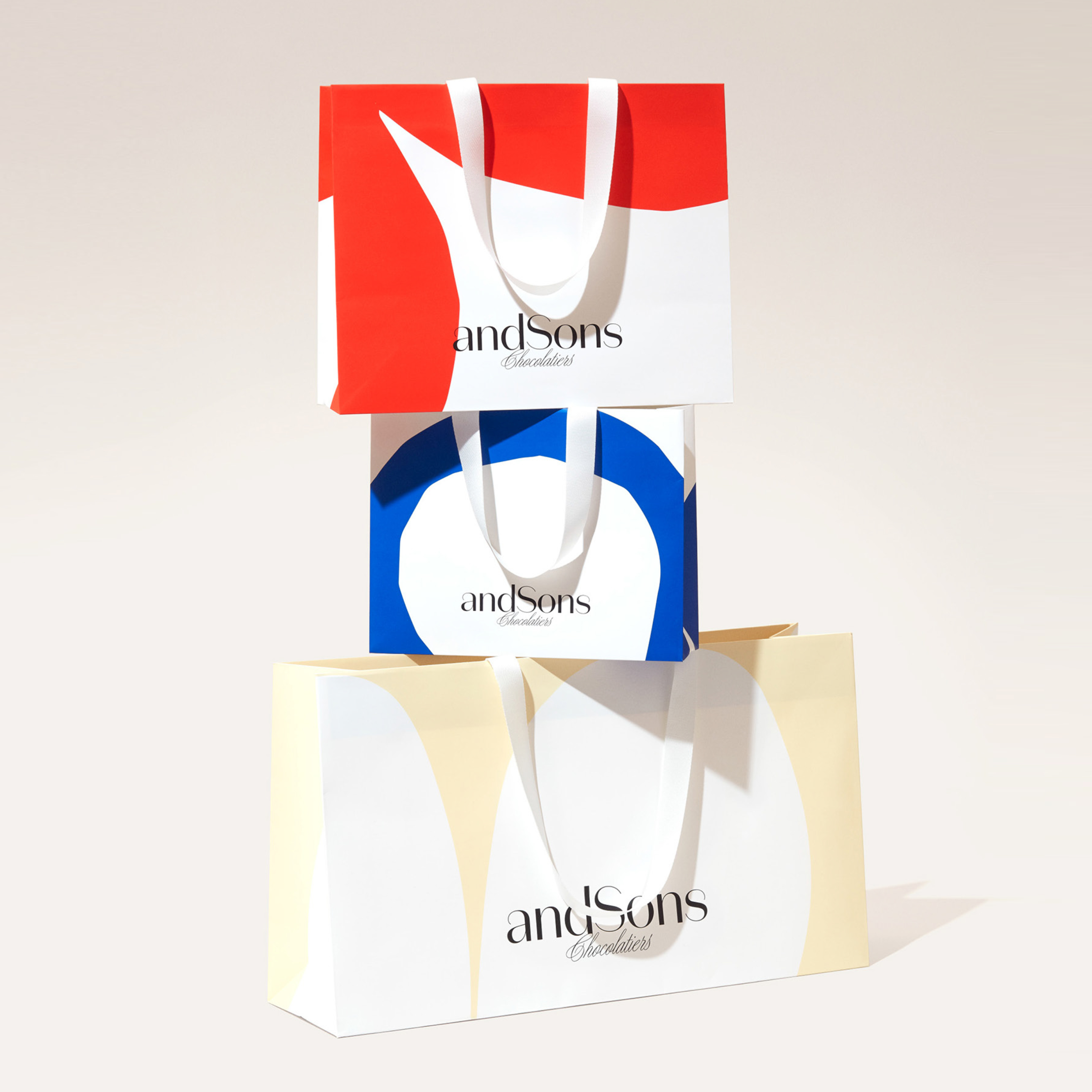
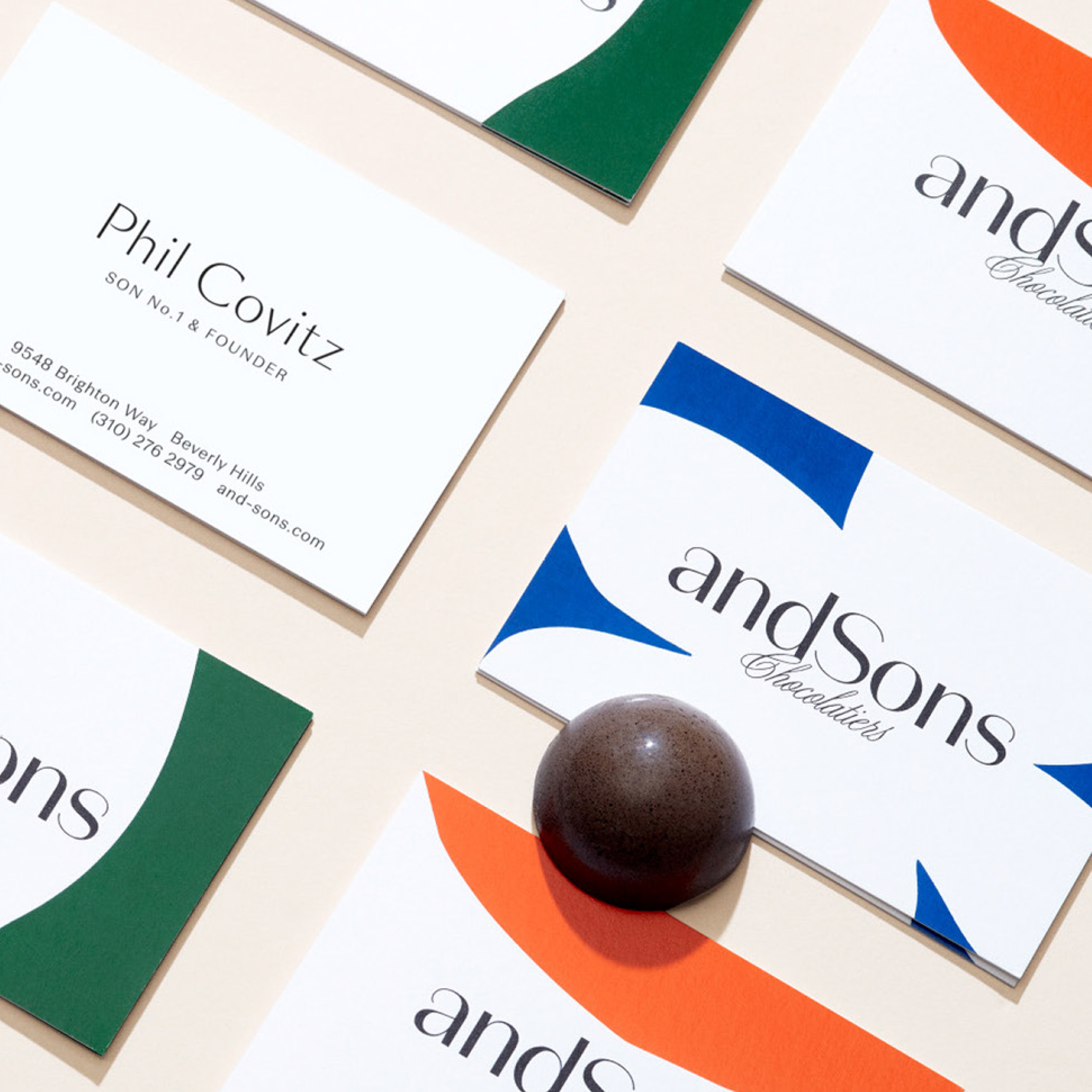
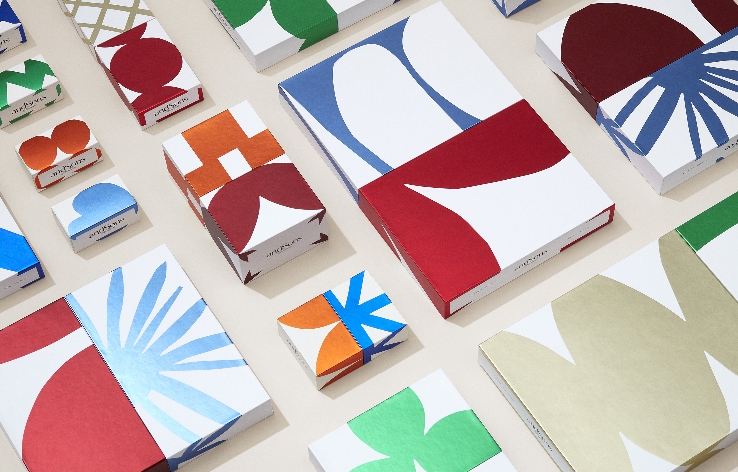
andSons Chocolatiers
Brand Identity, Illustration, Custom Packaging Design System, Brand Guideline, Printed Collateral
Client — andSons
Team — Base Design
Role — Design Lead
Traditional Novelties From Beverly Hills C.A.
Rooted in a deep understanding of French pastrytraditions, driven by invention and crafted for people with the warmth of Los Angeles California, the vision is to be a game changer in the stale/classic world of fine chocolate.
We created a timeless & iconic brand and a set of high end & collectible packaging that proactively play on the brand’s inherent tensions: Traditional & Contemporary, Respectful & Inventive, Refined & Generous, Masterful & Personal, Luxurious & Surprising.

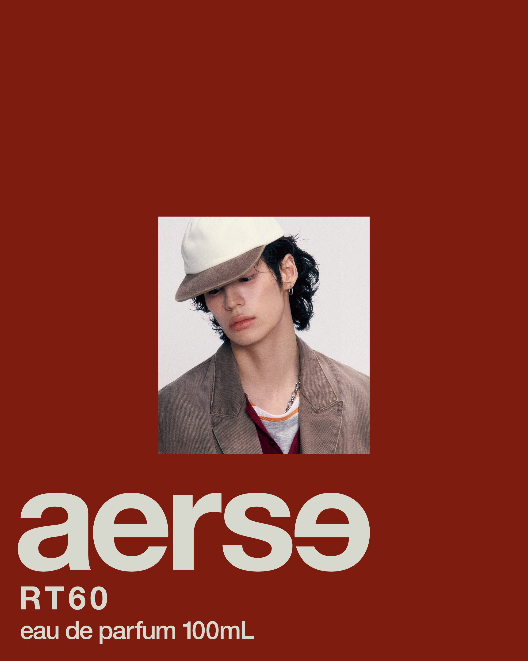
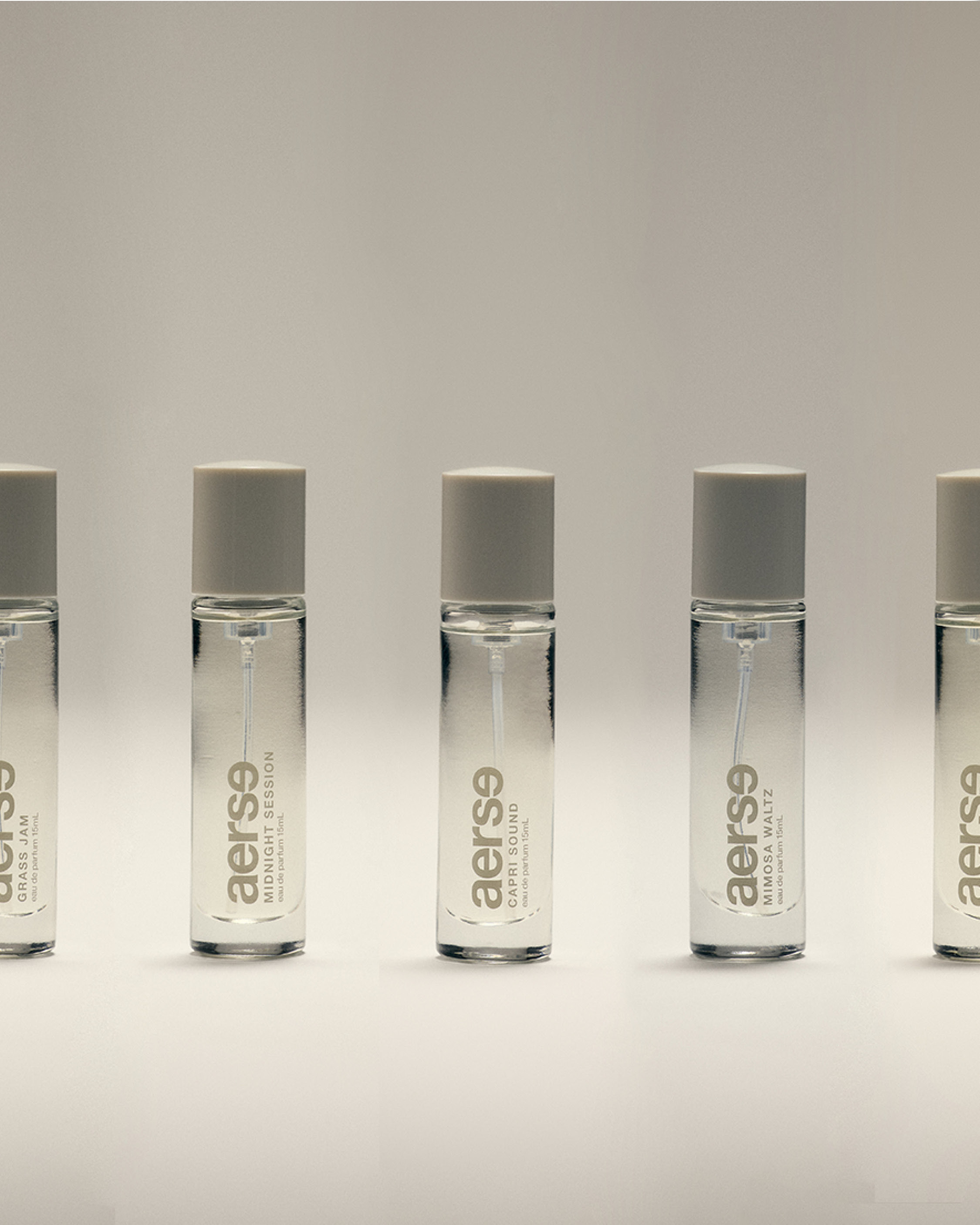
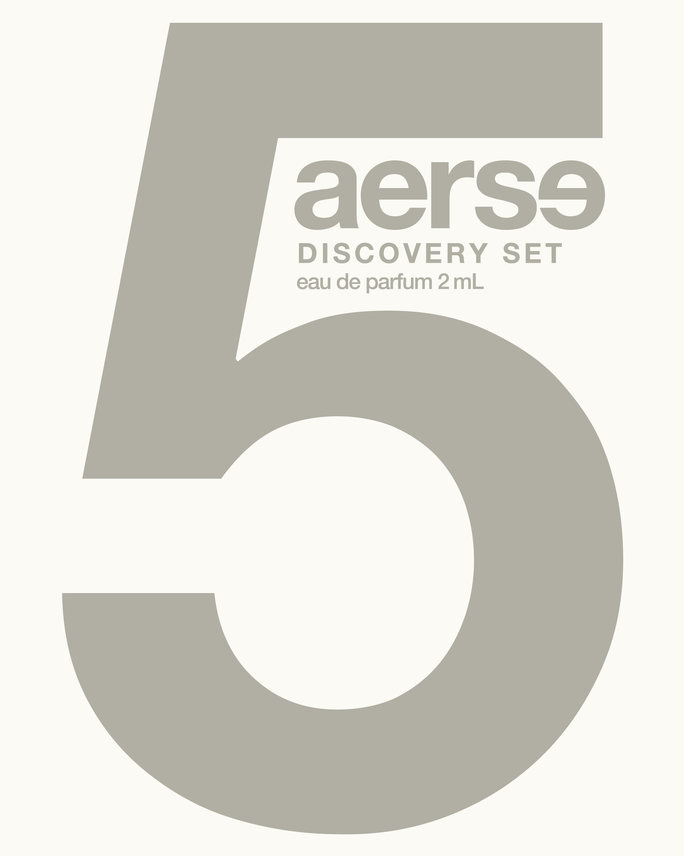
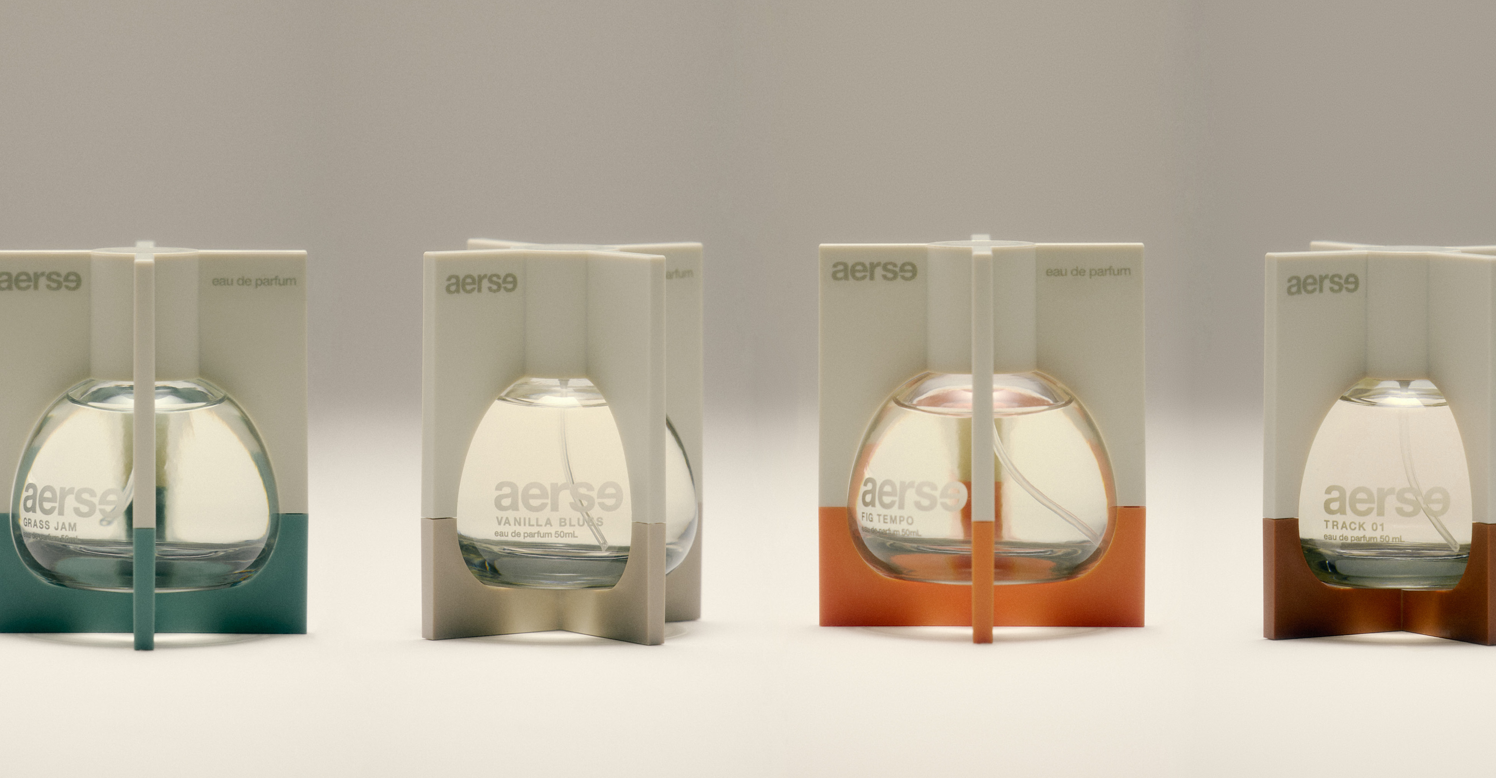
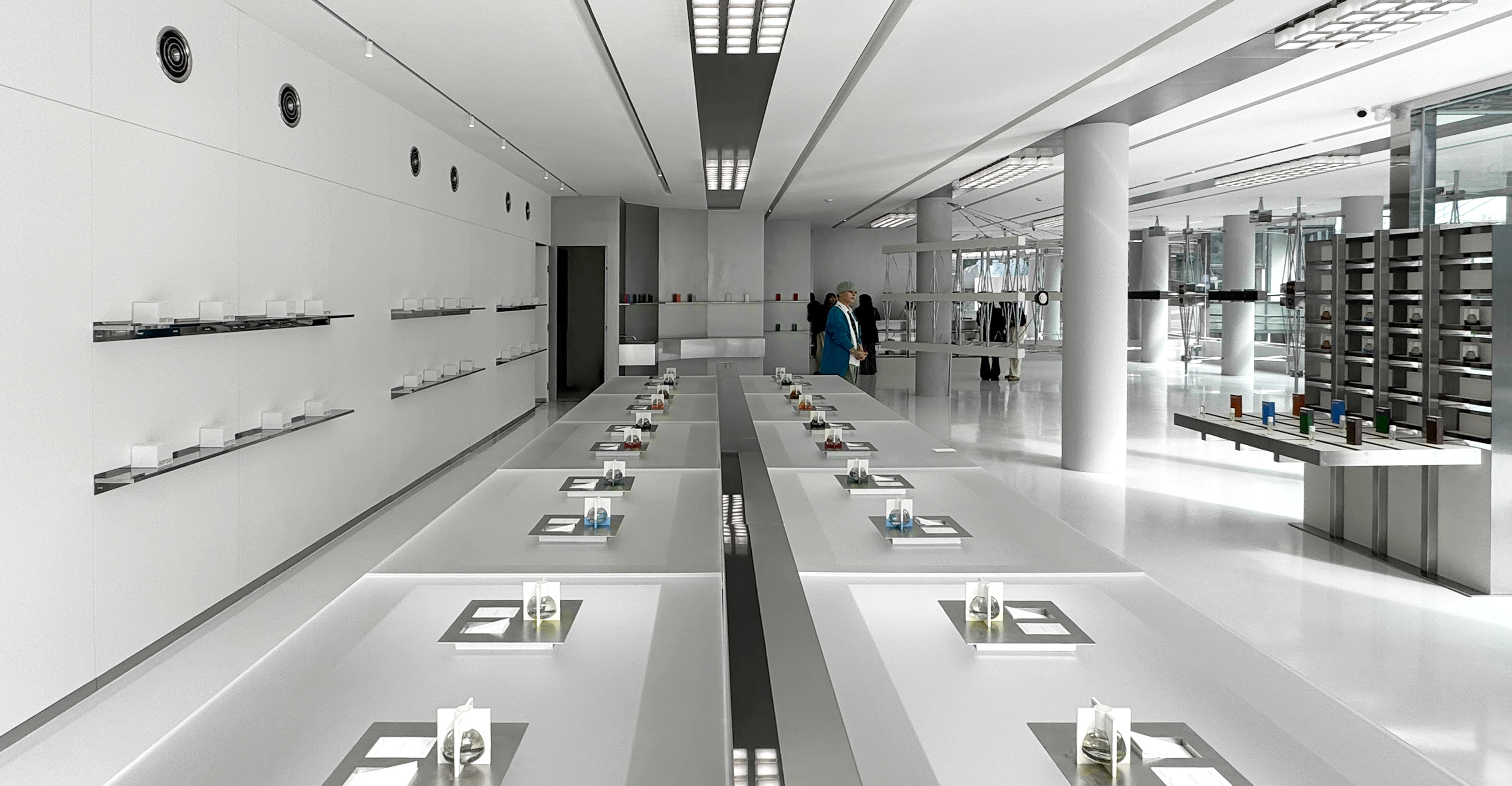
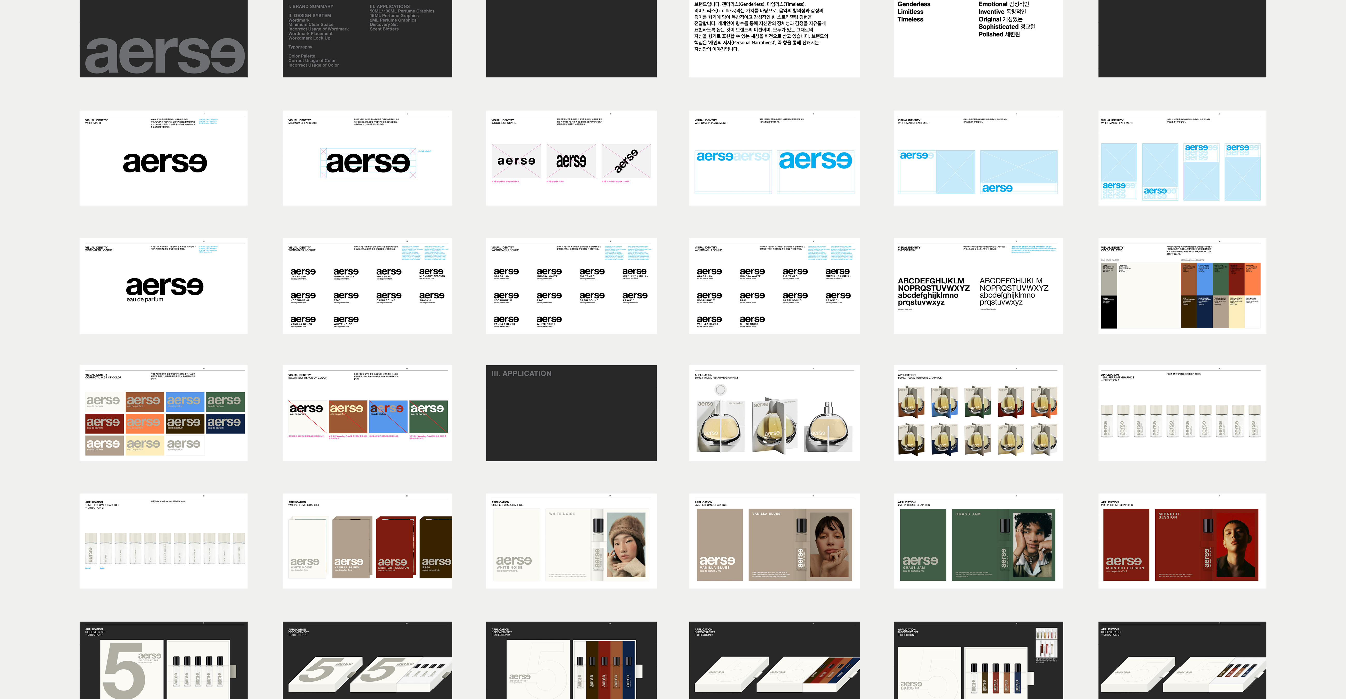
aerse
Brand Identity, Product Design, Art Direction, Packaging, Web Consultation, Brand Guideline


Client — aerse
Role — Creative Director, Art Director, Designer
Campaign — Team aerse
Bottle design — Offof co
Photo — hwangtoe studios
Space design — STUDIO GGJH
AERSE is a fragrance brand built on the belief that scent functions as a language; one that operates beyond words, logic, and fixed meaning. Just as music communicates through rhythm, tone, and resonance rather than literal description, scent carries emotional information that is felt before it is understood. It evokes memory, atmosphere, and identity without demanding clarity or conclusion.
Rather than treating fragrance as a tool for definition or categorization, AERSE approaches scent as an open system of expression. Each fragrance is intentionally non-prescriptive, allowing individuals to interpret, project, and complete the experience with their own inner narratives. Meaning is not delivered—it is discovered.
This philosophy extends into the brand’s visual identity and object design. Instead of illustrating scent through familiar motifs or decorative symbolism, AERSE focuses on framing the intangible. The bottle is conceived as a vessel that captures the invisible—emotion, tension, presence—acting as a quiet frame for something that cannot be fully contained.
AERSE’s collaboration with musicians further reinforces this concept. By inviting artists to create both a fragrance and a musical track, the brand explores how a single emotional landscape can be translated across two parallel languages. Sound and scent become different interpretations of the same internal world—neither illustrating the other, but existing in resonance.
Ultimately, AERSE positions fragrance not as a finished statement, but as a living language—fluid, subjective, and deeply personal.


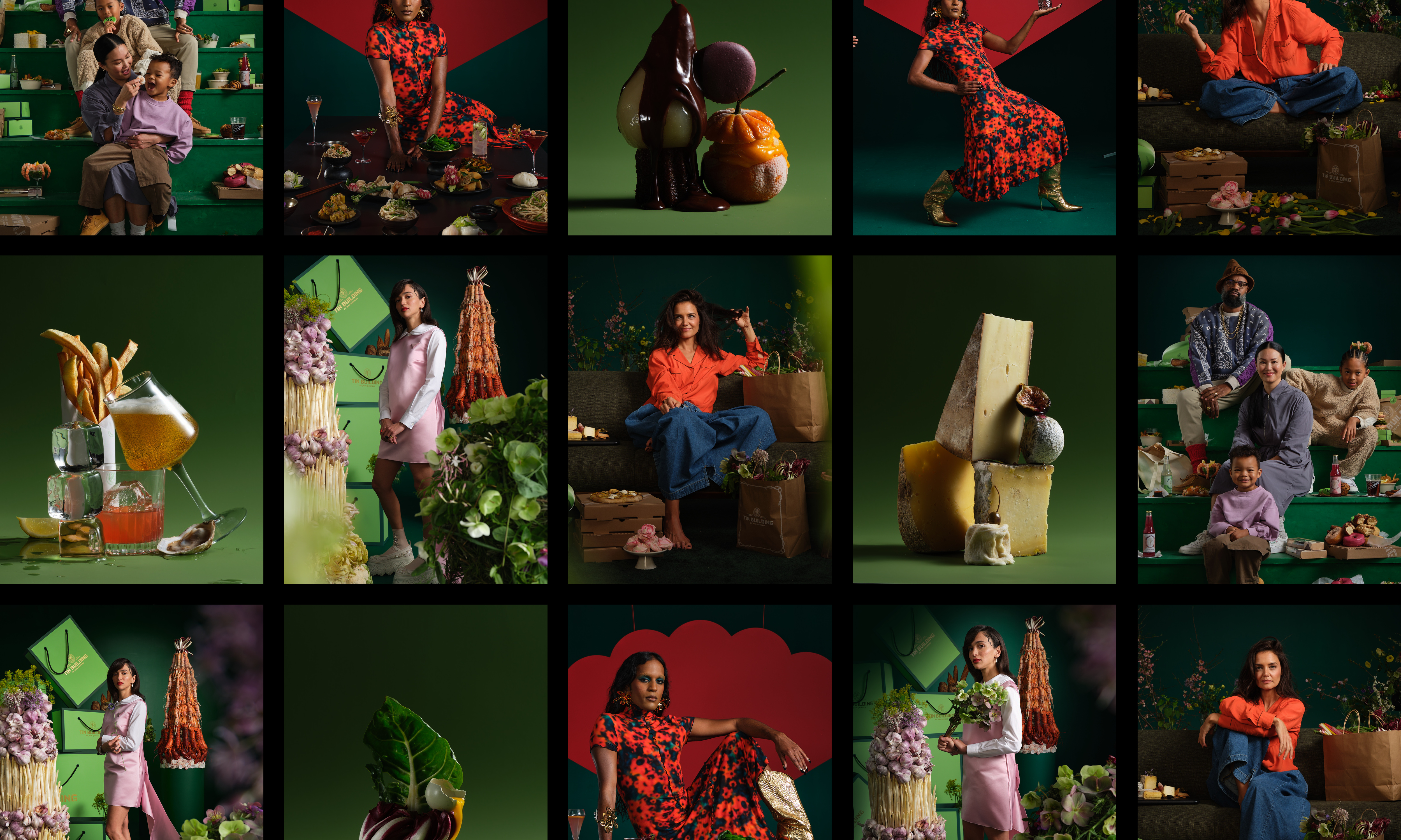
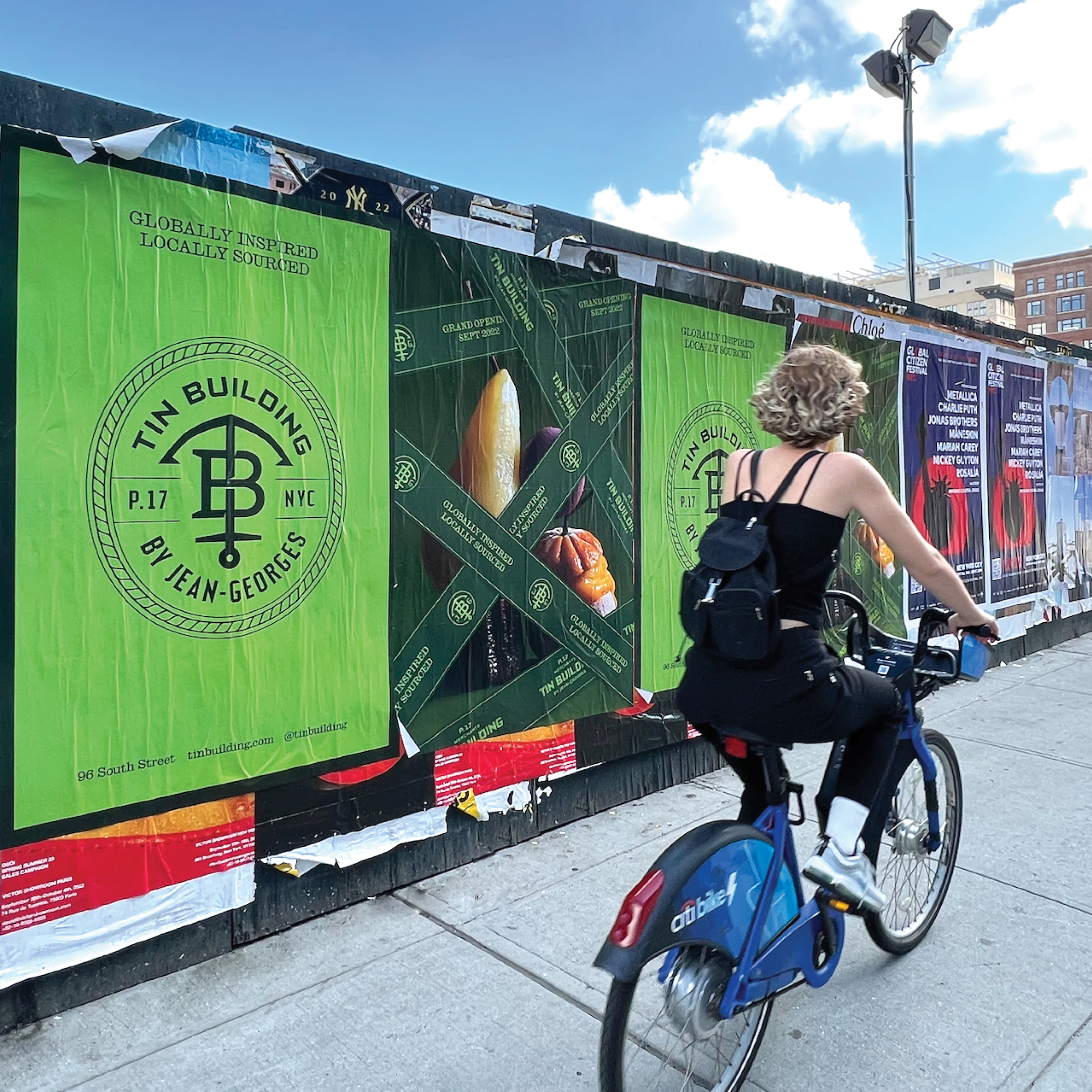
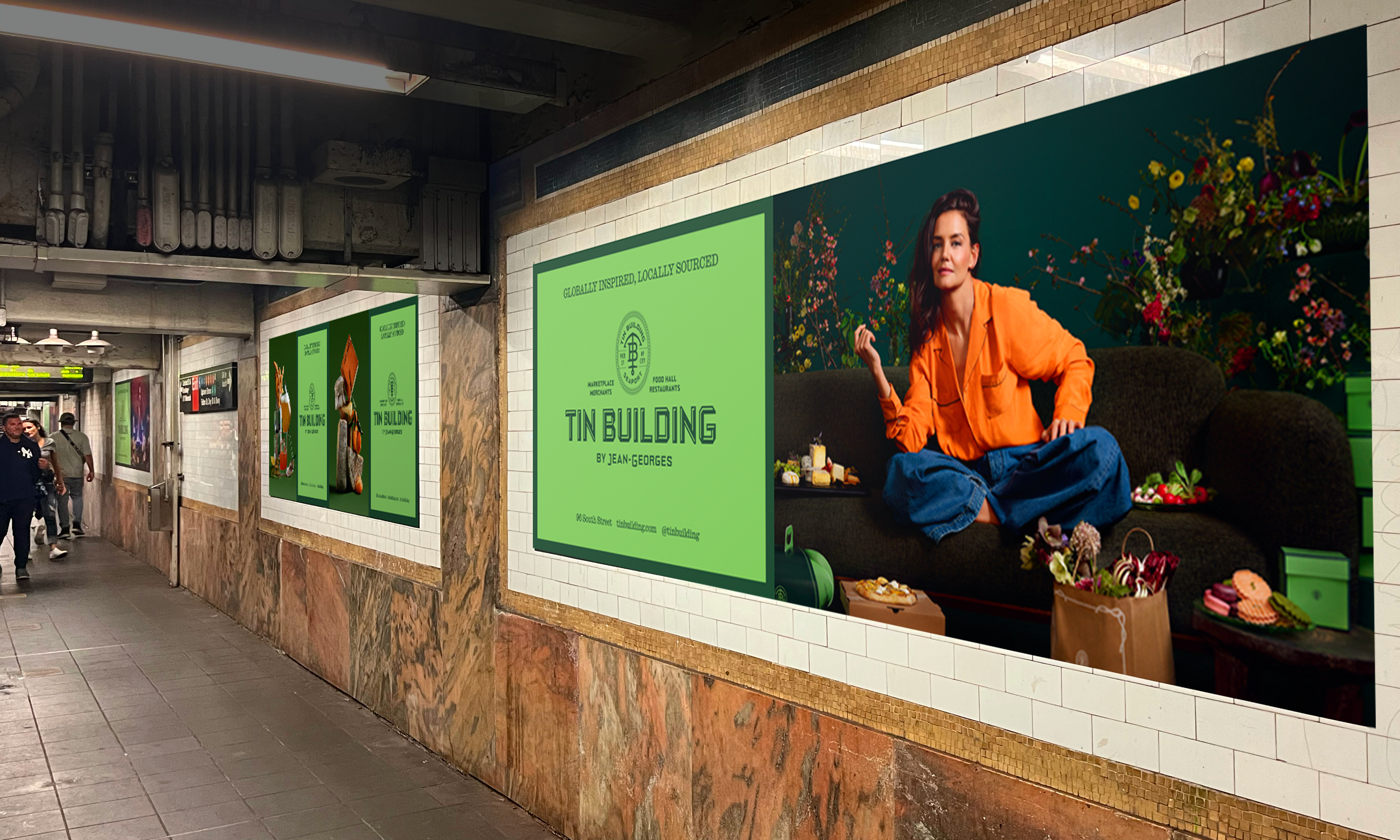
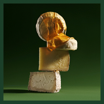
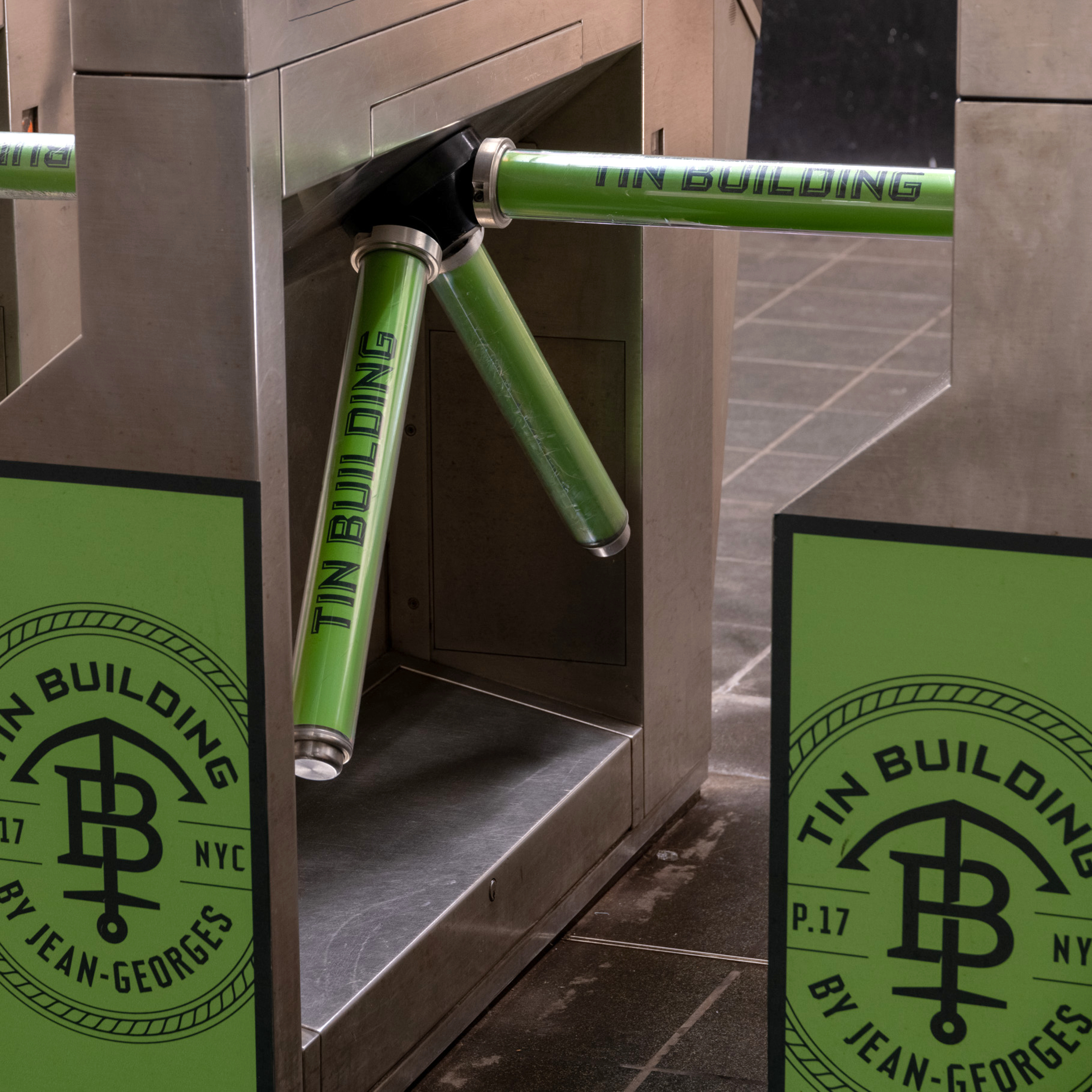
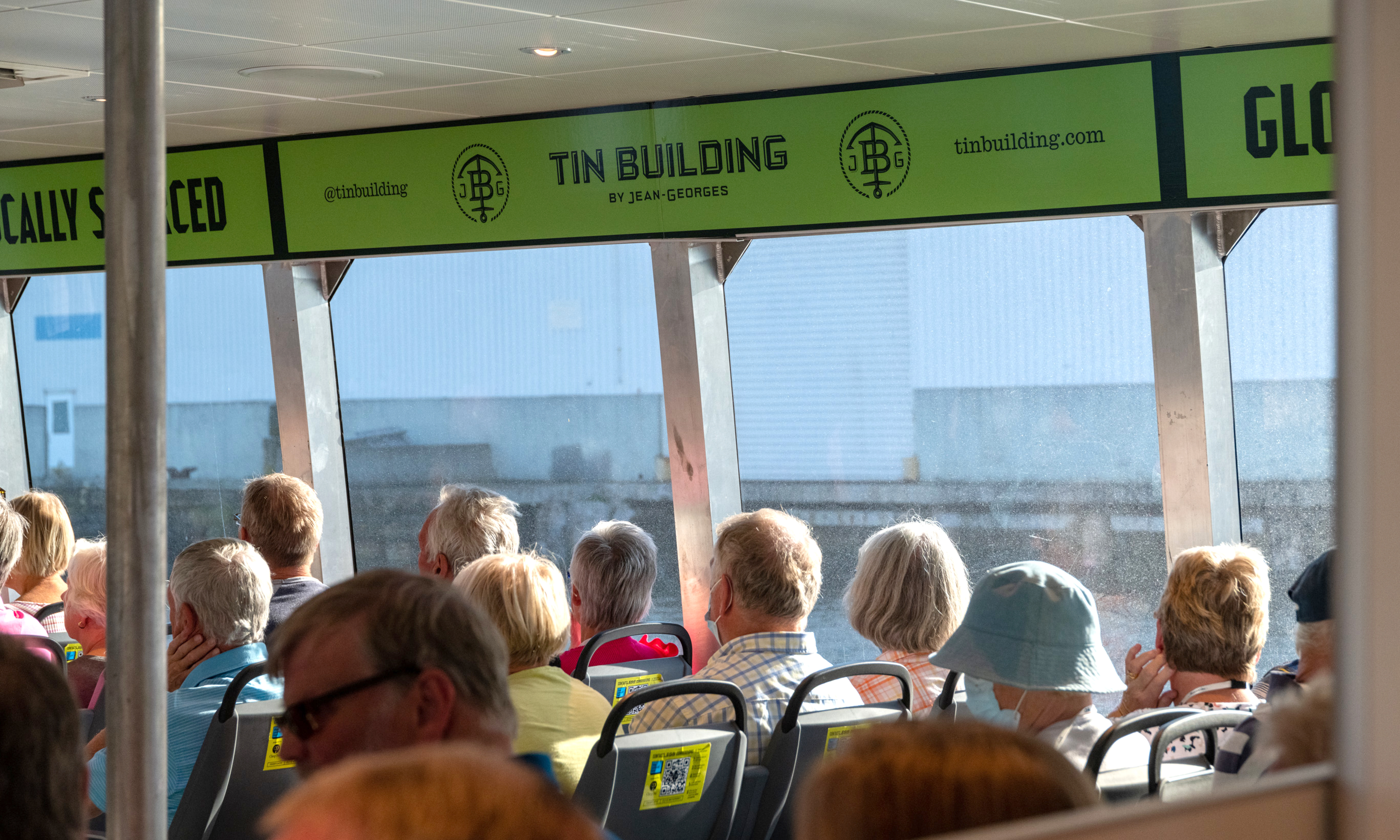
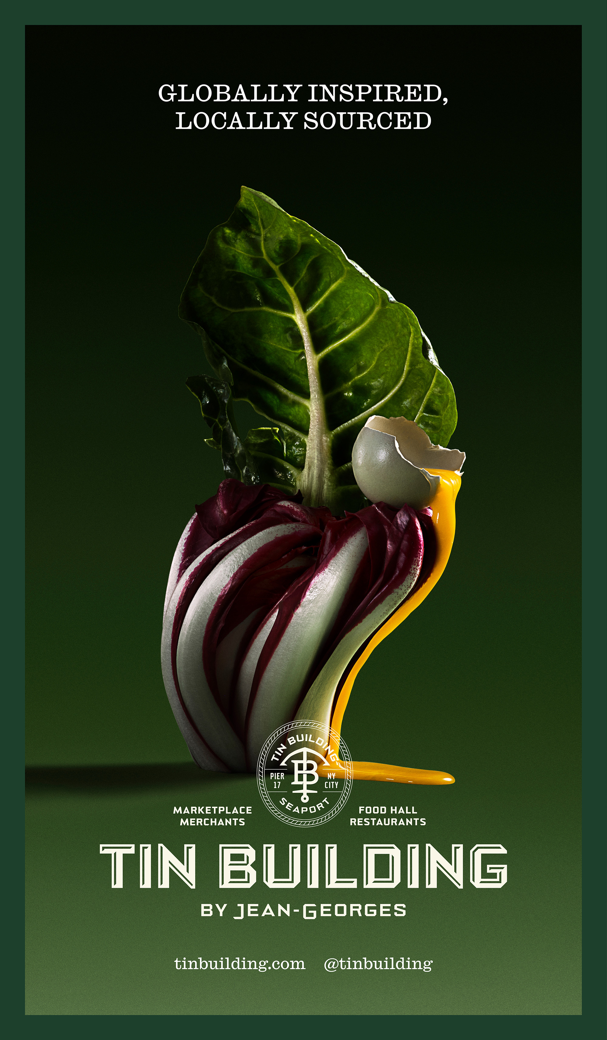
Tin Building
Campaign, Art Direction, Creative Direction, Printed Collateral
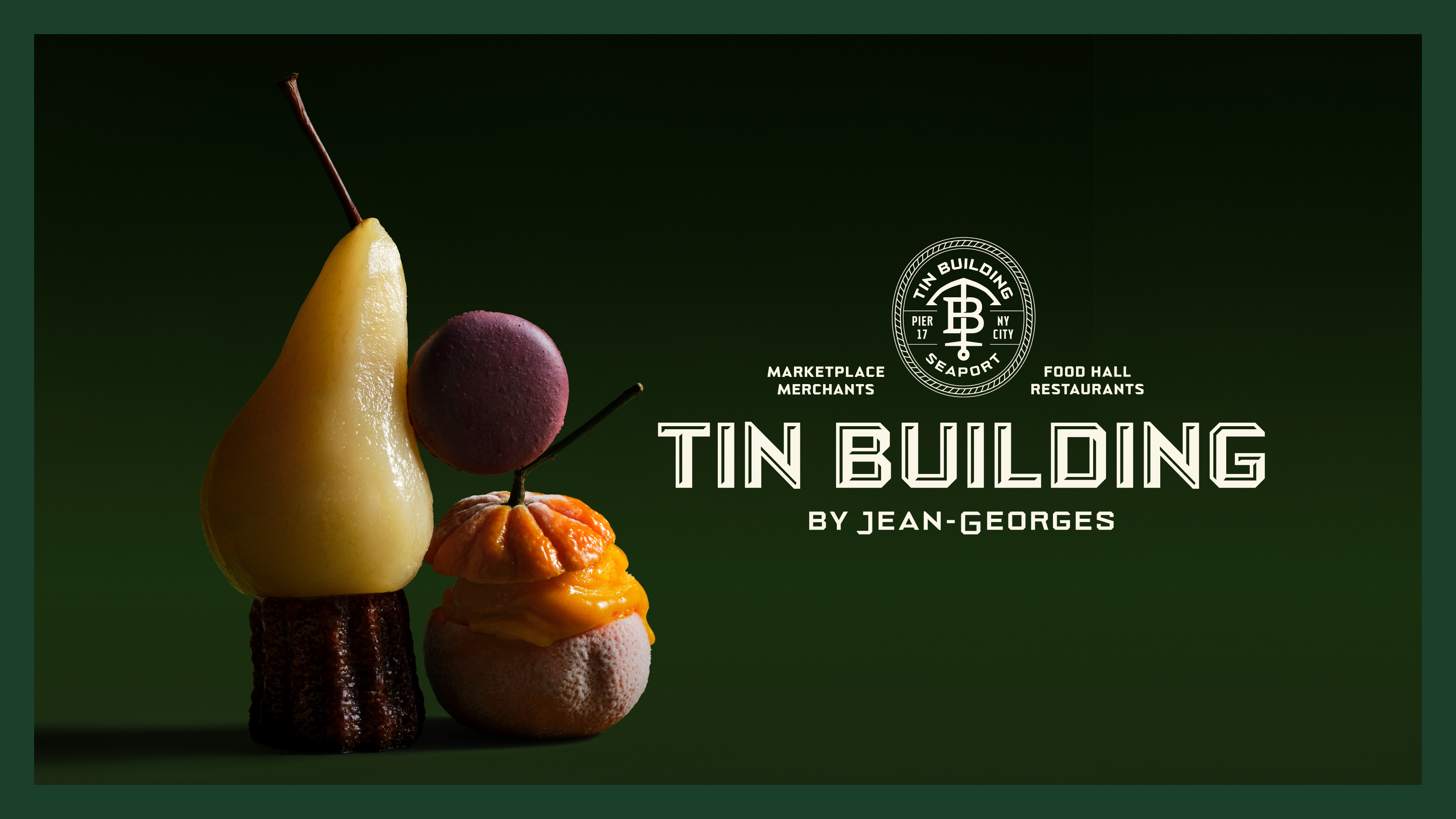
Client — Tin Building, Jean Georges
Team — 2x4 & Sunny Chen
Photographer — Suzanne Saroff
Role — Senior Design Lead
The Tin Building is a vibrant, eclectic marketplace housing three upscale restaurants and a multitude of market, retail, and casual dining experiences curated by Jean Georges. With a group of diverse partners, 2x4 clarified the organization’s core brand tenets through a comprehensive brand strategy, spanning messaging, communications, and audiences.